- Уроки
- 1 мин на чтение
- 187404
Procreate как никогда популярен среди диджитал-иллюстраторов: множество кистей, возможностей и настроек для создания графики. В этой подборке мы собрали 57 наиболее интересных и полезных уроков для тех, кто хочет освоить Procreate.
- #ipad
- #procreate
- #графический дизайн
- #иллюстрации
- #планшет
- #рисунок
- 0
-
27
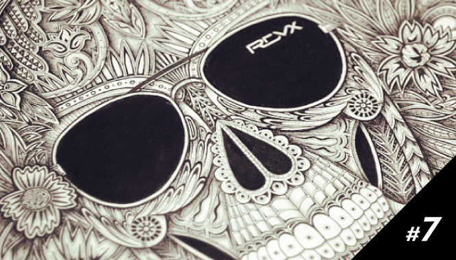
Портфолио недели #7: Иллюстратор Алекс Конахин
- 1
-
3662
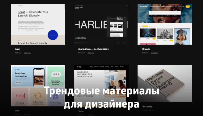
Трендовые материалы для дизайнера 2021
- 0
-
8926
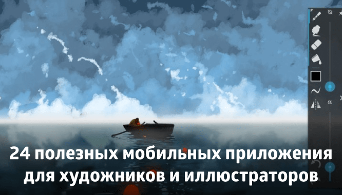
24 мобильных приложения для художников и иллюстраторов
- 4
-
126478
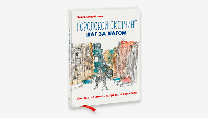
Клаус Майер-Паукен «Городской скетчинг шаг за шагом»
- 0
-
3916
Яна Андрушок — дипломированный художник со стажем рисования более 20 лет. 17 лет посвятила классической технике, диджитал рисунком занимается около 3 лет. Автор многочисленных образовательных курсов, основатель школы цифрового рисунка (instagram.com/andrushok_school), в которой обучается более 2500 учеников ежегодно.
Яна провела онлайн-занятие в Академии re:Store, на котором рассказала, как быстро создать портретный скетч, правильно прорабатывать тени и детали в программе Procreate, а также как разбивать изображение на простые формы. Чтобы вместе с Яной поэтапно научиться рисовать портрет, переходите по ссылке: https://youtu.be/1B4Y9Z9uUCU. Скачать авторский набор кистей и референс можно здесь: https://vk.cc/bZ5qix.
Начало работы. Зачем нужна разбивка на простые формы?
Сегодня для работы понадобится холст размером 30х40 см, DPI в значени 300 и цветовой профиль RGB. Холст необходимо расположить в горизонтальном положении и вставить в левую часть фотографию из подборки в качестве референса. Для наброска потребуется кисть «Просачивание чернил» из набора «Чернила», это стандартная кисть. Сначала нужно разбить тело на максимально простые формы. Детальная анатомия не требуется, только самое основное. Это нужно для лучшего ориентирования при переносе наброска в пустую часть холста.
Первая форма — круг. Это череп головы. Поскольку голова на референсе наклонена назад, вертикальная осевая линия будет смещена так же. Затем намечается подбородок и углы нижней челюсти. Из-за наклона головы линии глаз, носа и губ будут идти под наклоном. Но они остаются параллельны друг другу. Шея — форма цилиндра, плечи можно обозначить круглыми шарнирами.
Далее необходимо в настройках выбрать параметр «Направляющие» и «Рисование с привязкой». Это даёт возможность рисовать только вертикальные и горизонтальные линии. Выбрав новый оттенок для кисти, нужно перенести все крайние точки лица в правую пустую часть холста. Первые наметки можно сделать очень грубо, главное перенести все простые формы, которые были намечены ранее. Ориентироваться по клеточкам и вертикальным линиям направляющих достаточно просто. После наброска и переноса всех точек можно отключить слои с референсом и наброском, а также направляющие.
Детализировать набросок Яна рекомендует с бровей. От понимания расположения надбровных дуг уже будет проще выстраивать другие черты лица. Важно не забывать про глаза. Верхнее веко обтягивает глазное яблоко, поэтому всегда имеет выпуклую форму. Тень от верхнего века ложится на нижнее, важно помнить про работу света. Для растушевки можно использовать кисточки «Мягкая пастель» и «Волосы». Они создают интересные эффекты. При прорисовке стоит опираться на вертикальную осевую, которая есть в наброске. Черты лица не должны уходить в стороны.
Однако, если соотношение нарисованных элементов кажется непропорциональным, не стоит спешить всё стирать. С помощью инструмента «Толкать» в разделе «Пластика» можно скорректировать неудачные моменты.
Заливка цвета
Для заливки цвета подойдёт кисточка «Карандаш № 5 Мультик» из подборки. Это одна из самых любимых кисточек Яны для рисования в технике скетча. Кистью «Растушевка» из набора можно пройтись по границам кожи, это придаст красивый эффект скетча на коже.
Чтобы на проработке теней не было грязи, нужно увести цвет в более насыщенный оттенок. Можно пройтись одним цветом, но с разной степенью насыщенности тона по 3-4 раза. Важно помнить о работе света и теней. Если свет тёплый, то тень получится холодная и наоборот.
Подробную проработку теней и работу бликов Яна объяснила в своём видеоуроке. Присоединиться и попробовать свои силы можно по ссылке: https://youtu.be/1B4Y9Z9uUCU.
Сколько можно зарабатывать на диджитал рисунке?
— Любовь к диджитал рисунку была с первого взгляда. Я была абсолютно классическим художником и даже не думала, что есть что-то кроме этого. Муж подарил мне самый простой графический планшет и я начала рисовать. Сначала не получалось, так как это совершенно другая вселенная. Но со временем разобралась. Сначала на меня выходили блогеры с небольшой аудиторией с предложением работать по бартеру. Я соглашалась. Постепенно публикации стали попадать в топ. С 3 тыс. подписчиков аудитория выросла до 60 тыс.. Как только публикация попала в топ, сразу посыпались заказы. За первый месяц рисования портретов в диджитал я заработала 40 тыс. рублей, за второй месяц уже 90 тыс. Далее я стабильно рисовала по 3-4 портрета в день. В течение полугода набивала свой скилл. В месяц выходило 150-200 тыс. рублей просто сидя дома.
Что нужно делать новичкам, чтобы получить свой первый заказ? Совет от меня — рисовать, как можно больше, пополнять своё портфолио. Нужно рисовать известных моделей, брать фотографии звёзд в качестве референса. Побольше работать по бартеру. Мой первый заказ был для одной знакомой. Далее стало работать сарафанное радио. Желаю всем много энергии, мотивации и кучу классных идей. Главное их не закапывать и не забывать, а сразу воплощать на холсте
В этой статье мы расскажем, как рисовать портрет в Procreate с нуля:
-
как реалистично нарисовать портрет по фото;
-
как освоить разные техники рисования портрета;
-
какие инструменты и кисти для Procreate лучше использовать;
-
какие особенности и фишки программы помогут облегчить работу.
Также у нас есть две пошаговые инструкции рисования портрета по фото. Но прежде чем переходить к ним, дочитайте эту статью. Ведь здесь мы поговорим про основы и базовые техники, которые нужно знать.
Итак, рисуем портрет в Procreate. Разберем последовательно этапы работы.

Создать холст своего размера
Для поэтапного создания портрета в Procreate сначала потребуется холст. Создадим его нажатием на иконку «+» в правом верхнем углу экрана.
Чем больше холст и лучше качество изображения, тем меньше слоев вы сможете добавить.
Поэтому возьмем средний размер 3000 на 3000 пикселей и поставим разрешение 300 DPI.
При создании холста автоматически создается первый слой – фон. Следующие слои создаем нажатием в правом верхнем углу иконки «Слои» – добавить слой. Нижний фон по умолчанию белый и мы не станем менять цвет.

Выберем кисть для рисования портрета в Procreate
У каждого художника своя техника и свой любимый набор кистей. Со временем и вы подберете те, что будут удобны именно вам. У нас есть отдельная статья-инструкция о том, как скачивать, менять и создавать свои кисти. Там же вы можете найти наш бесплатный набор кистей для цифровых иллюстраций.
Сейчас же воспользуемся кистями, удобными при создании портретов в Procreate для автора. Нажмем на иконку «кисть» в библиотеке кистей. Из списка нам подойдут наборы «скетчинг», «чернила», «краски» и «аэрограф».
Для наброска можно выбрать карандаш или тонкое перо. Главное в рисунке наброска – это тонкие линии, которые помогут создать контурный рисунок.
Цвет для инструмента лучше взять монохромный: черный, серый или коричневый. Для заливки цветом подойдут кисти из набора чернил и красок. Тут все будет зависеть от задач и этапов рисования.
Если вам нравится рисовать портреты и вы хотите прокачать свои навыки в этой сфере, чтобы стать иллюстратором, рисовать портреты на заказ и зарабатывать, то у вас есть два варианта пути:
Учиться самостоятельно: изучить строение лица, анатомию, программы для рисования, познать всё это на практике путём проб и ошибок.
Онлайн-курс: преподаватель в сжатые сроки передает вам и всю нужную информацию и свой личный опыт, чтобы вы сразу могли начать зарабатывать на новой профессии.
Если вы хотите сэкономить свое время и довериться опытному профессионалу, то приглашаем вас на авторский курс Светланы Скляр “Портрет. Логотип. Аватар”. Светлана уже 2,5 года в коммерческой иллюстрации, а начинала она, не имея никаких навыков и художественного образования.
На курсе она делится всеми фишками, секретами и лайфхаками, которые помогли ей выполнить более 500 коммерческих заказов в России и за рубежом. Вы научитесь:
- рисовать портреты, похожие на фотографию;
- работать с мультяшным и реалистичным рисованием фигуры и лица;
- детальному построению тела и его частей;
- работать с клиентом, чтобы избежать ошибок на начальном этапе.
Посмотрите подробную программу курса и работы наших студентов, нажав на кнопку:
Ну а мы продолжаем разбираться в рисовании портретов. Все слои, кроме фонового слоя, создаются прозрачными. Переименуем второй слой в набросок. На этом слое мы и начнем рисовать скетч.
Если вы совсем новичок и рисовать, не срисовывая или хотя бы не поглядывая на оригинал, вам сложно, можно добавить на экран референс. Это отдельное окно, которое можно увеличивать и уменьшать, открывать и закрывать, двигать по экрану.
Нажимаем в верхнем левом углу иконку «Холст» – Референс – Включить. В окне референса можно сделать фотографию или импортировать фото из галереи, нажав на импорт. Функция референс очень облегчит рисование портрета в Procreate по фото.
Если вам ближе вариант обводки изображения, идем в левый верхний угол экрана: Настройки – Добавить – Вставить фото. Фото отобразится на холсте и в окне «Слои» появится еще один слой.
Создаем новый слой и на нем обводим наше изображение. Чтобы элементы было легче заполнять светом, создаем закрытые контуры.
Постарайтесь не рисовать много лишних деталей, так как когда мы начнем заливку цветом, многие из линий закроются тоном.

Рисование портрета по фото
Если же вы выбрали вариант рисовать «из головы», проще всего начинать с зарисовки общих форм. Рисуя портрет, соблюдайте несколько правил:
1. Композиция
Лучше всего размещать рисунок посередине холста, оставив равные отступы с четырех сторон. Композиционно портрет может быть по шею, плечи, грудь или по пояс. Удачным расположением считается, когда глаза на портрете находятся в верхней трети холста.
2. Пропорции
Нужно помнить, что лицо человека симметричное, поэтому рисуя в фас можно для удобства разделить холст пополам. Портрет будет смотреться эффектнее, если кадр построен на симметрии.
Чтобы соблюсти пропорции, нужно сразу наметить размер головы, шеи, линию плеч. В лице наметить линии глаз, бровей, носа, рта, волос и ушей. В программе Procreate есть инструменты, которые помогут вам при разметке пропорций – это «Направляющие» . Заходим в верхний левый угол настроек: Холст – Направляющие – Включить.
Голова человека имеет овальную форму, следовательно, рисуем овал. Шея – это прямоугольник, плечи – круги. Так, начиная с крупных форм, постепенно добавляем мелких деталей.

Рисование портрета с нуля
Для удобства во время работы можно вращать планшет, а можно и сам холст. Для этого просто прикоснитесь к экрану двумя разведенными пальцами и вертите его как лист. Таким же способом можно отдалять и приближать изображение для прорисовки мелких деталей. Неудачные линии можно удалить отменой действия – нажав двумя пальцами по экрану или воспользовавшись инструментом «Ластик».
Если появляется необходимость исправить пропорции или форму, поможет инструмент «Пластика». Он находится в настройках в левом верхнем углу. Благодаря пластике мы можем корректировать форму нашего скетча.

Иллюстрация преподавателя Procreateschool Светланы Скляр
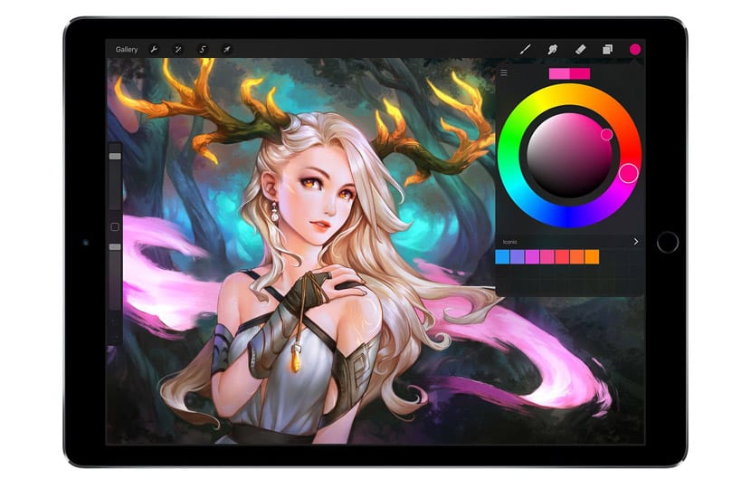
Когда наш скетч готов, можно начать работу с цветом. Для начала нам потребуется создать палитру. Заходим во вкладку с цветами. Она находится в правом верхнем углу экрана. Это маленький цветной кружок.
В открывшемся окне под цветовым кругом находится вкладка «Палетки». Нажимаем «+» и выбираем из выпавших вариантов: «Сфотографировать»; «Из файла»; «Из изображения в галерее». Выбираем «Создать из фотографии», заходим в альбомы в памяти вашего устройства, находим нужную картинку, нажимаем на нее и палитра автоматически появится в панели палитр. Переименовываем ее, чтобы не потерять.
Палитры можно создавать самому, можно импортировать и экспортировать.

Палитры в Procreate
Для закрашивания больших форм воспользуемся мягкими кистями. Очень удобно делать это с помощью кисти, имитирующей мягкий аэрограф.
Создадим новый слой и назовем его «Кожа». Подберем цвет из палитры. Для этого зайдем в цветную точку в правом верхнем углу. Можно выбрать цвет самостоятельно, можно взять образец с помощью инструмента «Пипетка» или забить параметры цвета цифрами.
Раскрашивать детали можно вручную, как кистью, или заливая целиком. Для заливки тонкой кистью обведем контур элемента, замкнем его и зальем цветом, просто перетащив тон из палитры цветов.
Поместим слой кожи под слой с наброском и способом, описанным выше, создадим слои для волос и одежды. Не забывайте писать названия слоев. Это поможет вам быстрее ориентироваться и работать.
Заливка в Procreate
Залив локально все элементы, можно приступать к прорисовке теней, затем бликов. Для этого не годятся жесткие кисти. Выбираем мягкий аэрограф или мягкие кисти. Не забывайте, что можно менять их размер и прозрачность. Подбираем оттенки на несколько тонов темнее основного цвета и прорисовываем тени. Не забываем определиться, с какой стороны на персонажа падает цвет и что окажется в тени.
Таким же способом создаем слой для бликов. Блики рисуются цветом на несколько тонов светлее основного и могут доходить до самого белого цвета. Для бликов можно воспользоваться и художественными кистями. Красиво смотрятся блики в виде звездочки, полосы или засвета.
С помощью инструмента «Растушевки» сглаживаем острые края и переходы.
Для прорисовки мелких и тонких элементов, таких как брови, ресницы, волосы, веснушки можно использовать специальные кисти, которые можно скачать в магазине Рrocreate или найти в интернете. Как найти, скачать и установить такие кисти мы с вами изучали в предыдущем уроке.
Обтравочная маска — это группа слоев. Самый нижний слой (базовый) определяет границы видимости всей группы. Они нужны для того, чтобы рисуя на новом слое не выходить за границы основного слоя. Можно залить силуэт, а на следующих слоях с помощью обтравочных масок дорисовать светотень, волосы, одежду, разные детали.
Сделать обтравочную маску очень легко. Создаем слой, рисуем на нем контур и заливаем его основным цветом. Над этим слоем создаем новый слой. Кликаем на иконку слоя и в выпадающей панели действий выбираем «обтравочная маска». Таких масок можно сделать любое количество.
Создание обтравочной маски в Procreate
Еще одна удобная функция поможет вам сделать тени. Эта функция называется «Режим наложения слоев». Эту функцию можно использовать для смешивания вышележащего слоя с нижележащим слоем. С помощью этого приема можно делать текстуры тени и блики. Тут очень большой диапазон вариаций. Можно поиграть и выбрать понравившийся вариант.
Когда все мелкие детали прорисованы, вы можете объединять некоторые слои. Для этого нажимаем на верхний слой и слой, с которым хотите объединить и в выпадающем списке выбираем «объединить». Можно выполнить сведение слоев, поставив один палец на первый слой, второй палец на второй слой и подтащив их друг к другу.
Это действие можно отменить только до выхода из сеанса рисования. Поэтому стоит быть осторожнее. Портреты в программе можно сохранять во всех популярных форматах и легко импортировать в другие приложения.

Пошаговое рисование из нашего Инстаграма
Рисование портрета по фото с каждым днем становится все более популярным направлением. Всё больше клиентов заказывают портреты на заказ для себя или в подарок для своих друзей. Также вы сможете рисовать логотипы для соцсетей, иллюстрации для визиток и брендбуков. Сейчас эта сфера достаточно свободна, чтобы успеть в ней реализоваться как иллюстратор и успешно получать постоянные заказы.
Обучаясь самостоятельно, можно потерять очень много времени и не увидеть всех своих ошибок. На авторском онлайн-курсе «Портрет. Логотип. Аватар» преподаватель будет проверять ваши домашние задания. Это гарантирует усваиваемость полученного материала, а также совершеннствование путем полезной обратной связи.
Жмите на кнопку:
Теперь нарисуем портрет в программе Procreate в акварельной технике.

Иллюстрация преподавателя Procreateschool Светланы Скляр
Нам потребуются акварельные кисти. У каждого художника свой набор любимых кистей. Вот некоторые из тех, что нам подойдут. Не забывайте, всегда можно поколдовать с настройками кисти.
Кисть Wild Ligth из стандартного набора Artistic создает эффект четкой границы с темными краями и светлым пятном внутри.
Еще одна интересная кисть – Mural, находится в наборе Calligraphy. Эта кисть рисует максимально приближенно к акварельному эффекту. Тон ложится неравномерно, а с растяжкой от светлого к темному и с эффектом неожиданных пятен.
Для эффекта пятен также очень подойдут стандартные кисти из раздела «вода»:
-
мокрая губка;
-
брызги;
-
пятно.
Эти кисти помогут сделать эффект пятен. Нужно сделать одно касание кисти по экрану и расположить пятно на месте, где оно будет смотреться наилучшим образом.
Акварельная кисть Pinting имеет очень размытые акварельные края и имитирует эффект акварельной бумаги с разводами.
Есть акварельные кисти, которые выглядят как отдельные мазки, есть и те, что изображают подтеки. Большое разнообразие бесплатных и авторских кистей можно найти на официальном сайте Рrocreate.
Для правдоподобности можно добавить на нижний слой фон с текстурой акварельной бумаги. Такую текстуру легко найти в интернете. Акварельная бумага имеет рифленую перфорацию. Рисунок на таком фоне будет выглядеть еще более реалистично. Другой способ – добавить текстуру верхним слоем, включив в настройках режим «Умножение».
Прежде чем рисовать, обязательно посмотрите на акварельные работы, выполненные на бумаге. У акварели есть общее отличие от остальных техник – это, конечно же, прозрачность и воздушность. А также наложение цветов и красивые разводы. И все это возможно воссоздать в диджитал акварели, в программе Рrocreate.

Иллюстрация преподавателя Procreateschool Светланы Скляр
Работу красками начинаем также с заливки больших плоскостей, постепенно переходя к акцентам. Оптимально рисовать в прозрачности не больше пятидесяти процентов.
Инструмент «заливка» тут нам не подойдет. Лучше делать заливку кистью вручную, как при рисовании настоящими акварельными красками. Бледные тона можно будет сделать более яркими, используя наложение слоев.
Техника акварели подразумевает легкую небрежность, поэтому заливаем формы, не доходя до краев линий, а где-то и заезжая за них. Это будет создавать эффект работы настоящей кистью.
Сначала заливаем средние тона, затем рисуем тени, позже всего рисуем блики.
Для рисования мелких деталей используем тонкие мягкие кисти с эффектом легкого нажатия. В портрете акварелью большое внимание уделяется именно ярким деталям: глазам, губам, волосам, тогда как остальные элементы рисунка могут быть едва залиты одним тоном.
Края акварельных работ часто оставляют незаконченными. Не всегда рисуют и фон.

Работы учеников курса
1. How to Use Layers in Procreate
Step 1
In this tutorial on drawing in Procreate, I’m using an iPad Pro, an Apple Pencil, and the Procreate 5.2 app.
First, we need to create a Canvas. Open Procreate and press the + icon in the top-right corner of the screen.


Then press the + icon in the top right of the New Canvas menu to create a custom size.


I’m going to be using a 3000px by 3000px canvas size. I find this works well for square pieces that are high quality whilst retaining a larger number of Maximum layers. You can see the Maximum layers for your canvas size at the bottom of the table. Then hit the orange Done button to launch your canvas.


Step 2
Now, let’s look at using the Layers panel. The panel can be found by tapping the double square icon in the right-hand corner of the screen.


To create a new layer, tap the + icon in the top-right corner of the menu.


You can switch layers by tapping to select the layer you’ll be drawing on. If you keep drawing on a single layer, you’ll notice that all of your shapes will move together.


Step 3
You can move objects on a layer by tapping the Transform tool icon.


If you would like to separate your lines, make sure to select a separate layer to draw on. You can now move your shapes separately from one another.


Step 4
You can move layers around by pressing and holding on a layer and dragging it. Moving a layer behind another one will place that shape behind the shape on the other layer.


Step 5
You can hide and reveal layers by tapping on the checkbox at the edge of each layer.


2. How to Use Brushes in Procreate
Step 1
If you want to learn how to draw in Procreate, next up we’ll look at brushes. The Brush Library is opened by tapping on the Brush Library icon at the top of the screen.
Here you’ll find a variety of default Procreate brushes, organised into the categories shown on the left. There’s a mixture of both traditional and digital style brushes, as well as textures and stamps.
To select a brush, simply tap on it, and it will now be ready to use.


Step 2
You can adjust the size of the brush by dragging the Brush size slider, which is located to the left of the screen. Dragging the slider upwards will increase the brush size, whilst dragging it downwards will decrease it.


Step 3
You can save a brush size by holding the Brush size slider with one finger, whilst tapping the plus icon on the menu that pops up with another finger.


Repeat this process and tap the — icon to remove the marker. To select the saved brush size, simply drag the slider over the marker.


Step 4
The bottom slider controls the opacity of the brush. The lower you drag the Brush opacity slider, the lower the opacity of your brush will become.


3. How to Sketch in Procreate
Step 1
Next up in how to draw with Procreate, it’s time to begin sketching! First, I’m going to open my reference photo.
One way of doing this is to open the Actions menu, tap on Canvas, and then turn on the Reference switch.


This will open a Reference box, and you can move this by holding and dragging the top of the box.


You can use the Canvas setting to use existing drawings on your canvas as a reference. This is helpful if you’d like to reference another part of your canvas whilst being able to zoom in on a different section.


The Face option allows you to take a reference photograph, which could be helpful if you want to recreate an expression, for example.
The Image option allows you to import an image from your photos library. Here I’m going to add the image I downloaded earlier by tapping the Import image button to import my photo.


The image will now appear inside the Reference box. To close the Reference box, tap on the x icon in the top-right corner.


Step 2
Another method of working from a reference photo is to split the screen between two applications. This is my preferred method.
Simply open your reference image, and then swipe upwards from the bottom of the screen to open the shortcut menu.


Tap and hold the Procreate icon, and drag it to the left of the screen.


With a half split screen, some of the Procreate menu bar items are hidden, so I prefer to work in 3/4 screen by dragging the divider in the middle to the right slightly using my finger.


You can now use both applications simultaneously, allowing you to zoom and move around both parts of the screen using your fingers and a pinching motion.


Step 3
Now it’s time to sketch! First, I’m going to map out the rough shapes of my drawing. I’m using an Airbrush for this because I just want to create loose guides.
I begin with a circle for the head, and I continue to use shapes and loose lines to mark out the rough proportions of the drawing. I’m not going to add any detail at this point—I’m just marking where the main shapes and features will go. This will serve as a guide before I begin the next stage of sketching and adding more detail.


Step 4
Once this sketch is complete, I’m going to increase the size using the Transform tool set to Uniform, which means the shape will hold its current proportions.


Step 5
Now it’s time to create a more refined and detailed sketch layer. First, I’m lowering the opacity of my initial sketch to make it easier to draw over.
To lower the layer Opacity setting, tap on your layer to open the menu, and drag the slider.


I’m then creating a new layer above this to draw on, before selecting my sketch brush.


Step 6
I’m going to edit this brush slightly by tapping on it to open the Brush Studio.
You can change a variety of settings here. I’m increasing the StreamLine setting to the maximum. This makes the brush create smoothed lines, which is very helpful when sketching as it steadies your outlines. Press Done to confirm your changes.


Step 7
Next, I’m going to begin to create my refined sketch with this brush.
I create all the separate elements of my drawing on different layers to make them easier to edit, but you could draw on a single layer if you prefer to work this way.


Step 8
Once I’m happy with this sketch, I’m going to Flatten the multiple layers into a single image and layer. To do this, I will first need to select all of my layers.
You can select multiple layers and group them by swiping each layer to the left and then tapping Group in the top-right corner of the menu.


The layers are now grouped.


Tap the group and select Flatten from the menu that will open to the left. This merges all layers from the group into a single layer.


Step 9
Before we move on, let’s look at a few more helpful tools which can assist you whilst you sketch.
To flip or rotate a layer, select the Transform tool and tap on the rotation you would like to perform using the menu at the bottom. Here, I tapped Flip horizontal to reflect my layer.


With the Transform tool selected, you can use the guidelines that appear whilst moving an object to help you align it.


Step 10
To erase, tap the Erase tool in the top-right menu. This will allow you to erase any drawings on your selected layer.


You can edit your Erase brush to create different eraser effects using the Brush Library. To do this, tap the Erase icon and select the brush of your choice.


Step 11
I like to flip my canvas regularly whilst drawing as it helps me to spot any issues with proportions that I might have missed.
To do this, open the Actions menu and tap Flip horizontal or Flip vertical depending on your needs.


Step 12
Once I’m happy with this sketch, it’s time to create the final line art.
First I’m going to lower the Opacity of my sketch layer to make it easier to draw over, and then I’ll create a new layer above it.


Step 13
Now I’m drawing over the sketch with my line art brush to create the lines that will be used in the final drawing.
You can skip this step if you don’t use line art, or you could choose to do this at the end instead. I create each part on a separate layer to make it easier to recolour later.


Step 14
As you can see below, some of the lines from the dress layer are overlapping the flowers in front of it. To solve this issue, I’m going to create a Mask over the dress layer.


To create a mask, tap the layer and select Mask.


This creates a mask above the selected layer that allows you to erase things on the layer, but as this mask can be switched on and off, the changes can be reversed at any time by switching off or deleting the mask. This is a great tool to use if you’re unsure about permanently erasing something, or if you just want to test out how it would look without risking losing anything on your original layer.


Step 15
Now that my line art is complete, I’m going to select and Group all of these layers to keep them ready for later.


I’m then going to Duplicate this group and Flatten it into one layer, so that I can use this as a guide for adding the flat colours.
You can Duplicate a layer by selecting it, swiping over it to the left, and tapping the Duplicate button. This will create a duplicate of that layer or group, which can now be selected and moved.


4. How to Use Colours in Procreate
To continue learning how to draw in Procreate, now we’ll cover colouring.


Step 1
First, I want to prepare my guide layer.
I’m going to select the flattened line art layer and tap on the layer to open up the Blend Modes.
Blend Modes can have different effects on the colours and opacities of your layer and how it interacts with other layers and objects.


Step 2
I’m going to be setting my layer to Linear Burn mode, which produces a darkening effect over the base layer. This will help the colours of my guide layer to match better with the colours I will be adding beneath it, making it easier to see the outlines.


Step 3
I’m turning the Opacity of the layer down so that I can see the outlines of the shapes I will be drawing beneath it. This ensures I can create clean edges around my base colours.


The effects of the Linear Burn mode are demonstrated here. As you can see, the line art layer becomes a darker version of the colour on the layer below.
Increasing the opacity of the layer will increase the darkness of the lines.


Step 4
Before we begin to add our base colours, let’s look at how to use the Colours panel in Procreate. To open the Colours panel, tap the circular colour swatch in the top-right corner.
The Disc is the first option on the menu for selecting colours. You can drag the swatch around the colour wheel to pick the colour, and then drag the swatch in the middle section of the wheel to control the depth of your selected colour.


Next is the Classic option. This contains settings to control the Hue, Saturation, and Brightness of the colour. These can be adjusted by dragging the three sliders, and the depth of the colour can be edited by dragging the swatch around the square at the top.


Next is the Harmony option, which can be used to find complementary colours. Dragging one of the swatches will automatically move the other three swatches into complementary colours for your selected swatch.


Then we have the Values option. Here, you can input specific colour values for RGB or CMYK colour codes, depending on the colour mode your canvas is set to.


Finally, at the end of the menu, you can find the Palettes option, which contains saved colour Swatches.
To select a Palette, simply tap on a Swatch within that Palette.


To create a new Palette, select your chosen colour, open the Palettes menu, and tap the + icon in the top-right corner.
There are a few options you can use to create Palettes from. I’m going to select Create new palette to make an empty one.


To add Swatches, simply tap on any grey empty square within the palette, and your swatch will now be saved.


Step 5
Now let’s add the flat colours. I’m selecting an ink liner brush so that the edges of my shapes will be slightly grainy.
On a layer behind the guide layer, I’m going to start to outline the first shape, which is going to be her face. The most important thing here is to ensure that there are no gaps in the outline.


Step 6
Once the shape is outlined, there are two ways of colouring it. You can either colour by hand if you prefer the look of this or enjoy this process, or to speed things up you can use the ColorDrop tool.
To do this, drag the colour Swatch from the top-right corner into the centre of your shape, and keep the Apple Pencil held down.


You can adjust the level of fill by dragging the pencil across the screen to adjust the ColorDrop Threshold slider at the top.


Step 7
Now I’m going to draw the rest of the base colour shapes by creating new layers for each of them and using the same process.
Keeping them on separate layers will allow you to edit the colours more easily if you change your mind, and it will also help when shading later on. Here you can see how my drawing is looking with all the base colours filled in.


5. How to Shade in Procreate
Step 1
When drawing in Procreate, it’s important to know about this technique. Now it’s time to add some shading.
To begin, I’m going to create a new layer above the shape I want to shade, tap on the layer, and select the Clipping Mask option.


This creates a Clipping Mask around the layer so that you can only colour inside the shape the mask is created on top of.


I’m going to add some blush to my character, so I’m choosing an airbrush and shading under her cheeks.
You can see how the colour is contained within the face shape due to the Clipping Mask.


Step 2
You can add additional Clipping Masks by creating a layer above or below the current mask using the + icon and setting it to clipping mask.
Clipping Mask layers layered above or below each other will become masks of the same base layer beneath them.


Step 3
You can colour pick any colour within your drawing to set your current swatch to this shade.
To do this, hold your finger over any part of the drawing to launch the Eyedropper tool, and the colour beneath will become selected. You can hold and drag your finger around until you find your desired shade.


The selected colour will now match the shade you collected using the Eyedropper.


Step 4
Now I’m going to show you how you can use Blend Modes to assist with shading and adding highlights to your drawings.
I’m adding the iris and pupil colours as Clipping Masks over the eye base layer as I want to shade over all three, and I’m creating another Clipping Mask layer above these to shade on.


I’m then going to select the eye base colour and create a deeper and warmer version of it, which will be used as the base colour for my Blend Mode.


Next I’m going to open the Blend Mode menu and set the layer to Multiply mode. This mode darkens and increases the saturation of the colour the brush is set to, as well as the base colour beneath this layer.


I’m adding the shadow to the top of the eyes, and then once I’m happy with this I can play around with the Opacity to adjust the darkness of the shadow.


Step 5
Now I want to add some highlights, so I create another new Clipping Mask layer above the rest and this time set the Blend Mode to Add.
This brightens the base colour and can have a glowing or shiny effect at higher opacities.


Step 6
If you struggle to find good shading colours, here is a tip using the Multiply Blend Mode.
First, create a clipping mask above your layer and set it to Multiply mode.


Then, use the Eyedropper tool to select the base colour of the layer you’re shading over, and drag the colour wheel to a less saturated version of this colour.


This should now have created a shading colour that complements the base layer and that can also easily be adjusted using the Opacity slider to control the depth of the shadow.


Step 7
And here is how the character looks after adding the rest of the shading! Now it’s time to add some line art back in.


First, I am switching off the guide sketch layer and then dragging the grouped line art that I created earlier above all of the other layers and switching it back on.
I can now go through each layer and recolour the lines by creating darker versions of the base colours using the Eyedropper and dragging the swatch to fill them with the ColorDrop tool.


6. How to Edit in Procreate
Step 1
Once all the line art is edited, my drawing is almost complete! But first, let’s add some finishing touches.


I’m going to begin by adding a simple background.
I’m creating a layer behind everything else, and selecting my background colour.


Step 2
I can then drag the Swatch into the background to fill the canvas.


Step 3
Next, I’m going to draw a circle behind my character. To create a perfect circle, simply hold the pencil on the screen after drawing your shape, and then press the Edit Shape button that will appear at the top of the screen.


Tap the Circle option to create a perfect circle.
Your shape should now be in proportion. You can also do this for a variety of other simple shapes.


I’m going to fill the circle with a solid colour by dragging the Swatch in the top-right corner into the centre of the circle using the ColorDrop tool.


Step 4
I want to centre my circle, but as there are so many layers, the guides are getting a little confused. To fix this, I want to Flatten my character into one layer, so I’m going to select all of my layers and make a group.


Before I Flatten the layers, I want to make sure I have a backup of them. I can’t Duplicate the group due to the limited number of layer numbers on my canvas, so I’m going to Duplicate my canvas instead.
I can do this by heading back to the Procreate Gallery, pressing Select, tapping on my drawing to select it, and finally pressing Duplicate to duplicate my drawing and back up my layers.


I can then go into the Duplicated version and Flatten the layers without worrying about losing them.


I can now use the guides easily to centre my character and the circle behind her.
Adding a shape behind a character is a really easy way to help it stand out against the background.


Step 5
Now I’m going to select my character layer and add a special effect from the Adjustments menu. There are a variety of colour edits and special effects within this menu, so this is where you can really play around and have fun!
I like a grainy effect on my drawings, so I’m selecting Noise.


I’m going to set this to 3%; you can edit the percentage by dragging your finger across the screen.


Step 6
Let’s look at making final colour adjustments. I’m going to select Curves from the Adjustments menu, which controls the levels of various colours within your drawing.


To edit the levels, drag the lines to create a new point on them. You can instantly see the effects of doing this on your selected layer. I don’t usually like to edit these much, but it can be a really helpful tool for quickly editing the tone of a drawing.


7. How to Export in Procreate
Finally, it’s time to export the finished drawing. Open the Actions menu and tap on the Share tab. You can now choose your preferred file type. I’m selecting JPEG and then pressing Save Image to add the file to my photos app.


And We’re Finished! You Learned How to Draw in Procreate!
Our character is now complete! Thank you for following this tutorial with me, and I hope you have lots of fun trying out these brushes for yourself.


5 Amazing Procreate Brush Sets From Envato Elements
Now you know how to use Procreate to create beautiful works of art. If you use Procreate on a regular basis, why not check out Envato Elements to expand your brush library and take your art to the next level?
The subscription-based marketplace offers unlimited Procreate brush sets, add-ons for Photoshop and Illustrator, premium fonts, and much more. The entire library is included for one flat monthly fee.
If you’d like to discover more premium Procreate brushes, here we have five amazing options:
1. Texture Brushes for Procreate (BRUSHSET)


Take your art to the next level with the beautiful textures in this Procreate texture brush set. Containing a variety of textures made from natural materials such as sand, cardboard, paper, and sugar, these brushes will add dimension to any flat shape.
2. Procreate Pencil Brushes (BRUSHSET)


Check out this must-have Procreate pencil brush set, containing 24 amazing textured pencil style sketch brushes. They’re perfect for doodling, sketching, colouring, and more, so release your inner child and let your imagination go wild!
3. Procreate Lettering Brushes (BRUSHSET)


Take your lettering to the next level with this amazing Procreate lettering brush set. Every lettering artist needs to have this set in their brush library. The set contains textured, monoline, calligraphy, and signature brushes to suit all of your needs.
4. Graphite Pencils for Procreate (BRUSHSET)


Do you want to use the freedom and capabilities of digital art, but miss the traditional look of pencil on paper? Then this is the perfect brush set for you! Containing 16 realistic graphite style brushes, this is the perfect set for replicating traditional methods in the digital realm.
5. Pattern Brushes for Procreate (BRUSHSET)


Check out one of the coolest pattern brush Procreate sets on Envato Elements. This set contains 36 unique pattern brushes to help you speed up your drawing process and add a sprinkle of fun to your designs. The brushes are also perfect for creating seamless patterns.
Discover More Helpful Procreate Tutorials and Resources
If you enjoyed this drawing with Procreate tutorial, make sure to visit these other helpful Procreate tutorials and resources from Envato Tuts+:
Если то, что вы ищете, это сделать шаг вперед и войти в мир цифровой иллюстрации, приложение Procreate — лучший инструмент для старта.
Размножаться, это самое скачиваемое приложение в App Store и один из лучших в мире дизайна и цифровых иллюстраций. Он имеет различные функции, которые заставят вас использовать свои художественные навыки, будь вы новичок или профессионал в мире искусства.
В этом посте мы расскажем вам как рисовать в procreate шаг за шагом, простым способом и дать вам несколько советов, если вы новичок в этом секторе.
Индекс
- 1 Что такое Procreate?
- 2 Как рисовать в Procreate
- 2.1 Как создать новый холст
- 2.2 Как заменить кисть или ластик
- 2.3 Как создать новый слой
- 2.4 первый набросок
- 2.5 развитие идеи
- 2.6 начинаем раскрашивать
- 2.7 Последние штрихи, добавляем тени
Вы должны начать с самого простого, а именно знать, что такое Procreate и что стоит за этим приложением.
Procreate — это приложение для цифрового искусства, создано Savage Interactive в 2011 году.
Поскольку он был выпущен на рынок, произвел революцию на рынке приложений для цифровых иллюстраций, и стало справочным приложением для людей, интересующихся цифровым искусством. И этого он добился благодаря своей мощности, простоте использования и универсальности. Интерфейс очень интуитивно понятен, поэтому после небольшого изучения его будет очень легко использовать.
Является ли приложение доступно только для iPad или iPad Pro, с помощью которого можно делать иллюстрации от простых до очень подробных.
Как рисовать в Procreate
В этом посте мы увидим Как делать рисунки в Procreate шаг за шагом простым способом и выполните следующие шаги:
- Как создать новый холст
- Как заменить кисть или ластик
- Как создать новый слой
- первый набросок
- развитие идеи
- начинаем раскрашивать
- Последние штрихи, добавляем тени
Как создать новый холст
CСоздание нового холста — это первый шаг, который мы должны знать. чтобы начать работу с Procreate.
Это очень простой шаг, первое, что мы должны сделать, это открыть приложение на нашем iPad, выбрать файл + в верхней правой части нашего экрана, после чего появится окно, в котором мы должны выбираем размер холста, с которым хотим работать.
Если мы случайно хотим пользовательский холст, такого размера, который нам не предлагает приложение, мы можем создать сами.
Мы переходим в галерею холстов Procreate и нажимаем значок + в правом верхнем углу экрана. После касания этого значка появится всплывающее окно, в котором мы выберем параметр для настройки размера холста и мы дадим значения, которые мы хотим.
Как заменить кисть или ластик
Еще одним из наиболее важных основных моментов является следующее, как мы можем изменить кисть или ластик. Это очень легко сделать, и есть также широкий выбор на выбор.
Когда у нас есть холст, мы ищем вкладку кисти, которая находится в правом верхнем углу. Открывается меню и выбираем тот вариант кисти, который лучше всего подходит нам для работы.
Как создать новый слой
Procreate, как и другие дизайнерские программы, работает через систему слоев. Эти слои помогают организовать работу, и, разделив их, легче вносить изменения, комбинировать их или напрямую устранять.
Чтобы создать разные слои, мы должны разместить себя на холсте, нажать на файл слоя, расположенный в верхней правой части экрана, и выбрать +, и Procreate создаст новый уровень слоя.
первый набросок
Первое, что мы должны иметь, это один из идея, которую мы хотим дать жизнь в Procreate.
Мы помещаем себя перед нашим пустым холстом и касаемся значка ключа в левом верхнем углу, мы выбираем параметр холста, а ниже мы включаем параметр направляющие для рисования.
Мы собираемся начать делать набросок, и для этого мы выбираем цвет сероватого оттенка, не важно, какой цвет вы выберете, мы касаемся значка кистей и выбираем кисть для наброска и карандаш 6В, и начинаем быстро рисовать нашу идею.
Как только у нас будет набросок нашей иллюстрации, мы пойдем ретуширование, просмотр, определение формы.
развитие идеи
Как мы уже говорили, как только у нас есть набросок иллюстрации, далее следует следующее: определить формы, элементы, из которых она состоит. Иди давай подробности.
Мы получим эти детали, играя с различными кистями, которые предлагает нам Procreate, или с теми, которые мы загрузили, так как с ними мы можем играть. объемы и текстуры.
начинаем раскрашивать
Когда мы уже определили наш рисунок, следующий шаг, который мы должны выполнить, это раскраска, и это не похоже на другие дизайнерские программы, где вам нужно выбирать части и раскрашивать их, в Procreate вы указываете на нужный цвет в верхней правой части холста и перетаскиваете его на дизайн, и как только вы отпускаете кнопку Apple Pencil или палец, которым вы перетаскивали, отмеченное место будет заполнено цветом.
Очень важно, чтобы окрашиваемая область хорошо закрыта, В противном случае произойдет то, что цвет займет весь холст.
Размножайся со своим обтравочная маска, позволяет рисовать, не выходя за пределы, то есть вы можете вырезать один слой в другом, но то, что вы можете рисовать в слое ниже, а не в другом.
Чтобы создать обтравочную маску, сначала вам нужно создать новый слой, появится меню, мы коснемся опции обтравочной маски, и она у вас есть. На этом слое появится стрелка, указывающая на слой ниже. Как только вы начнете рисовать, вы увидите только то, что находится внутри нижнего слоя.
Последние штрихи, добавляем тени
Источник: Apple
Как только мы закончили нашу иллюстрацию, раскрасили ее и добавили детали, пришло время придать ей форму. последние штрихи.
Чтобы у нас не осталось плоской иллюстрации того, что мы ищем объем, мы должны играть с кистями и цветами. Если у нас есть вариант идеальной кисти для теней, в противном случае мы очень просто объясним, как создать тень.
Сначала нам нужно определить область, в которой мы хотим разместить тень. выбираем кисть и цвет, похожий на тот, что использован на иллюстрации, есть два варианта: либо берем очень мягкий тон, близкий к пастели, либо понижаем непрозрачность цвета и закрашиваем выделенную область, пока не создадим идеальную тень.
Procreate — это приложение с несколько инструментов и опций чтобы помочь вам при рисовании. Как мы уже знаем, он имеет широкий ассортимент кистей, но всегда есть возможность загрузить больше разновидностей кистей на веб-порталах или импортировать их из Adobe Photoshop, если вы привыкли работать с ними.
Мы надеемся, что эти основные шаги сослужили вам хорошую службу при рисовании в Procreate шаг за шагом, и теперь вы можете начните давать волю своему воображению при рисовании.
Содержание статьи соответствует нашим принципам редакционная этика. Чтобы сообщить об ошибке, нажмите здесь.