Хотя последние несколько лет много говорят о том, что инфографика мертва, это не так. Она жива и здорова, и подтверждение этому ТОП самых популярных статей на Лайкни за прошлый год, где первые два места уверенно занимают инфографики.
Так вот, мало того, что инфографика жива и здорова, она еще и остается важным элементом многих контент-маркетинговых стратегий.
В 2018 году 65% маркетологов в сегменте B2B использовали инфографики, а, по замечанию Джона Медины, эксперта по биологии развития, добавление изображения в текст повышает вероятность того, что материал будет сохранен, на 55%.
Так что если у вас есть штатный дизайнер, самое время поставить ему задачу сделать сногсшибательную инфографику и потом ждать море трафика. Но что делать компаниям, у которых нет компетенций в дизайне или бюджета, чтобы нанять специалиста на аутсорсе?
Например, научиться делать простые инфографики с помощью PowerPoint по инструкции HubSpot, переведенной Лайкни.
1. Как сделать инфографику, наполненную данными
Инфографика и визаулизация данных созданы друг для друга. Так что как только у вас появляются новые данные, которые нужно показать миру, используйте этот формат. Именно для этого предназначен шаблон «Любитель данных».
В конце статьи можно скачать шаблон, который можно наполнить собственными данными. Чтобы изменить данные в диаграммах, кликните правой кнопкой мыши по графику, выберите «Объект» и приступайте к настройке.
Несколько рекомендаций, какой тип диаграммы стоит выбрать в зависимости от ваших целей:
- Гистограмма используется для сравнения категорий или отображения изменений во времени.
- Круговая диаграмма пригодится для сравнения частей целого, лучше всего подходит для работы с небольшими наборами данных.
- График подходит для отображения данных, которые меняются с ходом времени. Идеален для отражения волатильности, трендов, ускорения или замедления процессов.
- Кольцевая диаграмма – стилистический вариант круговой диаграммы, который позволяет разместить в центре число, подпись или какой-то графический элемент.
- Линейчатая диаграмма используется как гистограмма, но горизонтально расположенные столбцы удобнее для отображения длинных названий.
2. Как сделать инфографику-хронику
История отрасли, продукта, бренда или явления могут стать отличным подспорьем для инфографики. И хотя визуализировать процессы, растянутые во времени, можно по-разному, хроника была и остается одним из классических вариантов.
Как сделать хронику в PowerPoint?
1. На панели инструментов выберите SmartArt
Чтобы сделать хронику в PowerPoint на панели инструментов, перейдите в меню «Вставка», выберите SmartArt. Там вы найдете несколько десятков графических элементов, подходящих для вашей задачи.
2. Найдите вариант, который соответствует вашей задумке, в меню «Процесс»
Есть две группы элементов, из которых получаются хроники. Первая – «Процесс». Чтобы облегчить выбор, на скриншоте ниже подсвечены наиболее подходящие варианты.
3. Или выберите «Чередующиеся круги рисунков» в меню «Рисунок»
Еще одна группа элементов, которая может подойти, – «Рисунок». Выберите эту категорию и найдите вариант «Чередующиеся круги рисунков». На скриншоте ниже они подсвечены красным.
4. Добавьте недостающие или удалите лишние временные метки
Для иллюстрации будем использовать вариант «Чередующиеся круги рисунков». Добавьте нужное количество сегментов на слайд в зависимости от количества периодов, которые вы рассматриваете.
5. Отредактируйте текст и изображения
На этом этапе размер графика должен соответствовать объему данных, которые у вас есть. Начинайте заполнять временную шкалу информацией.
6. Отредактируйте текст и изображения графика
Как и с другой графикой, доступной в SmartArt, вы можете редактировать текст и изображения на свое усмотрение. Чтобы добавить изображение, кликните правой кнопкой мыши на значок с пейзажем, выберите рисунок «Из файла» и загрузите изображение с компьютера.
Если свобода творчества для вас не принципиальна, загрузите готовый шаблон, который есть в конце статьи. Он сразу откроется в PowerPoint. Обновите в нем периоды времени и текст и настройте визуальное оформление по своему вкусу. Сделать это можно в разделе «Формат».
Несколько моментов, о которых нужно помнить при создании такой инфографики:
- Исследование. Лучшая инфографика не та, которая красиво нарисована, а та, которая рассказывает историю, основанную на исследованиях. Поэтому прежде чем приступать к созданию хроники, изучите как можно больше информации.
- Узкие рамки. Период в сотню или тысячу лет – это очень интересно, но и на их изучение потребуется немало времени. Чтобы не растекаться мыслью по древу, выбирайте короткие промежутки времени.
- Меньше слов. Инфографика – в первую очередь визуальный формат. Если в какой-то момент вы поймали себя на мысли, что пишете более ста слов для каждого периода, лучше сделайте пост в блог.
3. Как сделать «ультрамодную» инфографику
Безусловно, «модность» инфографики зависит от того, кто ее оценивает. В шаблоне ниже много стрелок и баннеров – красиво это или нет, решать вам. Тем не менее на ней достаточно места для статистики и текста, а в нижней части поместилась гистограмма (вместо которой мог быть любой другой график: достаточно выбрать «Вставка» – «Диаграмма»).
Чтобы убедиться, что итоговый вариант достаточно хорош, обратите внимание на несколько моментов:
- Экспериментируйте с новыми цветовыми палитрами. Найти их можно прямо в Google Картинках по запросу «цветовые палитры». Подходящий вариант вставьте в PowerPoint. Затем в разделе «Формат» – «Границы рисунка» возьмите пипетку, выберите понравившиеся цвета и используйте их для своей инфографики.
- Потратьте время на манипуляции с фигурами. У PowerPoint большая библиотека фигур: рамки, ленты, стрелки и проч. – каждую из которых можно настроить в зависимости от ваших задач и вкуса. Например, концы ленты можно сделать тоньше или короче, а тело стрелки отрегулировать по толщине.
4. Как сделать инфографику в виде блок-схемы
Хотя на первый взгляд такие инфографики кажутся очень простыми, иногда нужно потратить немало времени, чтобы выстроить логические связи между блоками. В примере ниже структура блок-схемы максимально проста: положительные ответы ведут читателя к выводу в левом нижнем угла инфографики, а отрицательные – к результату в правом нижнем углу.
Как убедиться, что ваша блок-схема выстроена логично:
- Нарисуйте схему заранее. Прежде чем нырнуть с головой в PowerPoint, сделайте набросок своей блок-схемы на листе бумаги. Проверьте себя, отвечая на вопросы во всех возможных комбинациях и ища несостыковки. А еще лучше – попросите кого-нибудь постороннего пройти блок-схему.
- Чем меньше область применения, тем проще исполнение. Чем больше вопросов или этапов в схеме, тем сложнее ее реализовать и понять. Поэтому постарайтесь сузить ее насколько возможно.
5. Как сделать инфографику с кучей картинок
Все шаблоны, которые мы разбирали выше, основаны на визуальных элементах, созданных в PowerPoint. Но никто не мешает добавить в инфографику обычные изображения, особенно если это пойдет на пользу делу.
Шаблон ниже отлично подходит для сравнения различных категорий, идей или результатов. И его очень просто сделать: ведь от вас не требуется практически никаких усилий по созданию или настройке фигур.
Несколько советов, как сделать так, чтобы инфографика радовала глаз:
- Используйте качественные изображения. Лучше уменьшить картинку 2000х2000 пикселей, чем 20х20 пикселей. Сжимая из без того небольшие изображения, вы снабжаете инфографику «зернистым принтом».
- Соблюдайте границы. Они сделают изображения частью единого дизайна. В PowerPoint управлять размером, стилем и цветом границ можно во вкладке «Формат».
- Сохраните инфографику в формате PNG. Он хорошо подходит для всех инфографик, но особенно удобен для варианта, содержащего фотографии, так как PNG позволяет сохранить их качество. Как сохранить инфографику в формате PNG: «Файл» – «Сохранить как» – Нужная папка – «Тип файла» – «Рисунок в формате Portable Network Graphics».
Как и обещали – 5 шаблонов инфографик, представленных в статье, от команды HubSpot.
Если у вас есть опыт создания инфографики в PowerPoint, делитесь им в комментариях и присылайте свои примеры шаблонов или готовые графики.
If your infographic presentations aren’t getting noticed as you’d like them to, they’re likely missing something. It’s time to add some visual metaphors and other design techniques to your slides to make your information more visual and engaging.
In this guide, you’ll learn how to make an infographic in PowerPoint and use SlideModel templates to create attractive Infographic slides. With the help of visual metaphors, infographic illustrations and more graphic design elements, you’ll be able to put together infographic presentations like never before.
Table of Contents
- What is an Infographic?
- Which type of infographic should you use?
- Informational Infographic
- List Infographic
- Comparison Infographic
- Anatomical Infographic
- Data Infographics
- Statistical Infographics
- Geographic Infographics
- Process Infographics
- Flowchart
- How to / Steps Infographic
- Timeline Infographic
- Informational Infographic
- What is the purpose of using an infographic slide in a presentation?
- How To Make An Infographic In PowerPoint
- Tips for preparing data for effective infographics
- How to use SlideModel’s ready-made infographic templates to make your infographic in PowerPoint
- Case Study Example 1: Political Analysis Infographic Presentation
- Case Study Example 2: Admission Test Data Results Infographic Presentation
- Case Study Example 3: Marketing and Sales Infographic Presentation
- Case Study Example 4: Social Media Marketing Campaign Performance Infographic Presentation
- Create Engaging Infographic Presentations with SlideModel Templates
What is an Infographic?
An infographic is a visual that tells a story with data and information. Once upon a time, infographics were a design and marketing trend doing the rounds on blogs and social media. They were a welcome and fun take on the boring data we were all bored with. Nowadays, infographics have evolved into being relevant in any type of documentation that tells a data or information story. They’ve stopped being a trend and have justifiably taken a spot in the quintessential content stack for all businesses.
An infographic is a visual that tells a story with data and information.
Frequently, the terms ‘data visualization’ and ‘infographic’ are used interchangeably to describe graphics that visualize information. But there are some differences to take into consideration.
A data visualization is generally a chart or graph that must be read to understand. What differentiates it from an infographic is the way it’s put together. An infographic contextualizes data instead of just visualizing it, it’s a more creative approach that democratizes the way data is understood.
Infographics are sometimes made up of a collection of data visualizations, optimized to be more easily understood and more engaging than just a regular chart.
You can create an infographic however you like, as long as you’re using data visualization techniques and visual metaphors visually tell an informative story. You can even make an infographic with PowerPoint. Even better, use SlideModel templates to help you set it up.
Every infographic tells a story, and stories use visual metaphors to help readers relate to the content. These details convert regular charts into infographics, making them more memorable and engaging.
Visual metaphors are graphic elements that help tell a story in an infographic. For example, imagine a data visualization comparing water usage in cities and villages. In a simple chart without visual metaphors, you must dig deeper into the information to understand what is being analyzed. This only makes sense if the chart is included within a text that gives background and context.
Now, imagine this chart information with visual metaphors like icons of cities and villages and visualizations of drought. When visual metaphors are done well, the viewer can deduce what the infographic is about much faster through an ‘Aha Moment’ of understanding. This leads to the shareability of the infographic and easier communication between the presenter and the audience.
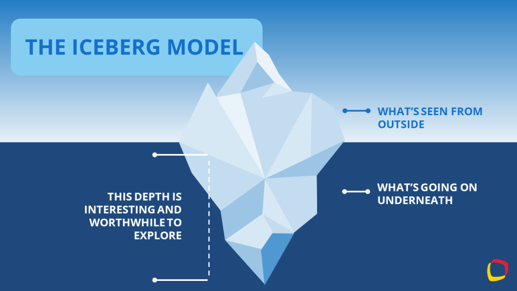
One of the greatest visual metaphors in infographic design is The Iceberg Model. This visual metaphor is of an iceberg sitting part underwater and a small section peeking over the water. The idea is that we see only what’s above water level, while everything else is hidden under the surface.
Which type of infographic should you use?
The type of infographic your team needs depends on if you will share contextual information, numerical data, or a progressive flow. Infographics are grouped into three main content categories; Information, data, and process. Let’s dig deeper.
Informational Infographic
The purpose of an informational infographic is to share contextual information with the help of visual storytelling.
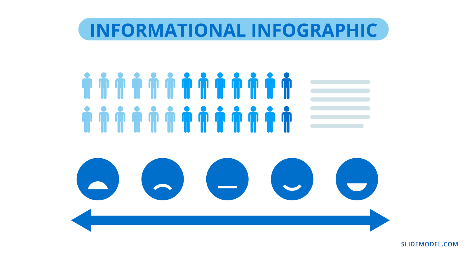
This type of infographic doesn’t usually include charts or graphs, it uses elements like icons, illustrations, numbers and shapes alongside short text. Information design projects like editorial and journalistic graphics, wayfaring and museum displays also fit into this category.
List Infographic
Creating an eye-catching list infographic is easy. Use icons and shapes to create visual sections for each list item. On each slide, include 3 or 4 list items and create a visual continuity between all slides that visualize the list. Alternatively, use a custom size slide in PowerPoint to create a vertical list infographic with a portrait layout. That said, you can use SlideModel templates quite easily on a custom-sized PowerPoint slide or learn how to change the slide size in PowerPoint here.
Comparison Infographic
A comparison infographic does what its name states. It compares two or more topics as visually as possible. There are several ways to visualize comparisons from simple to complex; in tables, bubble maps, and side-by-side widgets. Comparison infographic slides are great inside proposals and pitches.
Anatomical Infographic
An anatomical infographic visualizes all the parts and characteristics of a single topic, object, or person. Generally, the central visual topic is a physical object, not a concept. Parts of the main topic are then explained with text and graphics connected with lines. The most common use for anatomical infographics is in education and training.

Data Infographics
Eye-catching Data infographics are made up of data visualizations, anywhere from one to multiple visualizations. Often, the question arises if a single chart is also considered an infographic. Technically, yes, but it will depend on its visual quality and the viewer to decide for themselves.
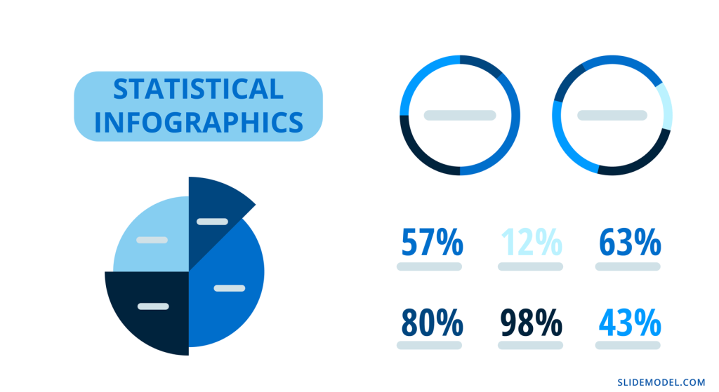
Statistical Infographics
Statistical infographics are the most data-centric of all the examples in this guide. These are the ones full of numbers and charts of all types to visualize information like survey results, research studies, sales and market analyses.
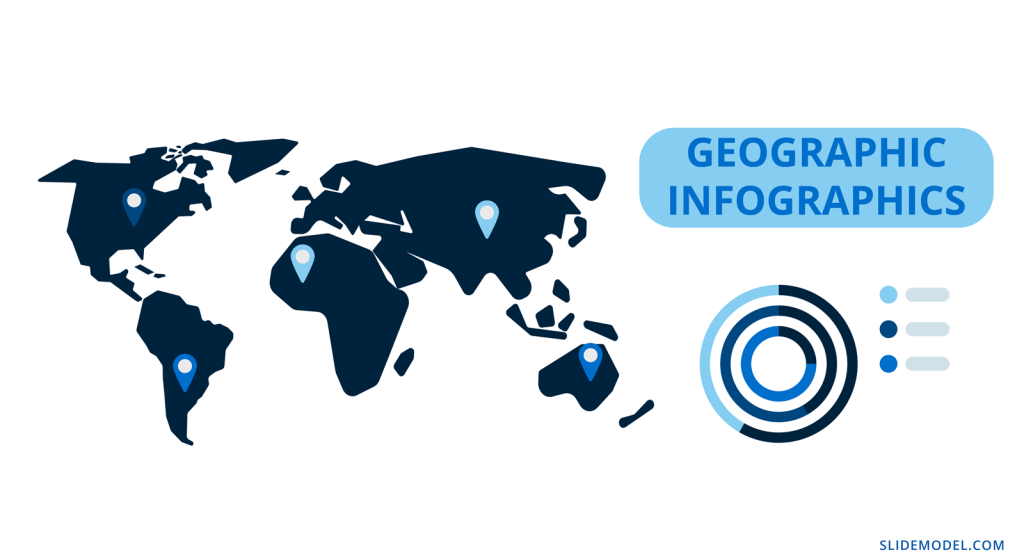
Geographic Infographics
Geographic infographics are made up of location data with maps and legends. They are used to present regional data. Maps can be color-coded to show geographic data from research studies, polls, and census records. Infographic map elements can also be added with location pins.
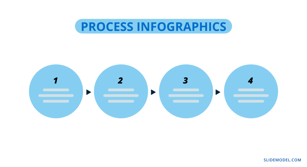
Process Infographics
Finally, the third type of infographic your business needs to know about is the process infographic. In this case, the idea is to visualize any type of information that follows a process or timeline.
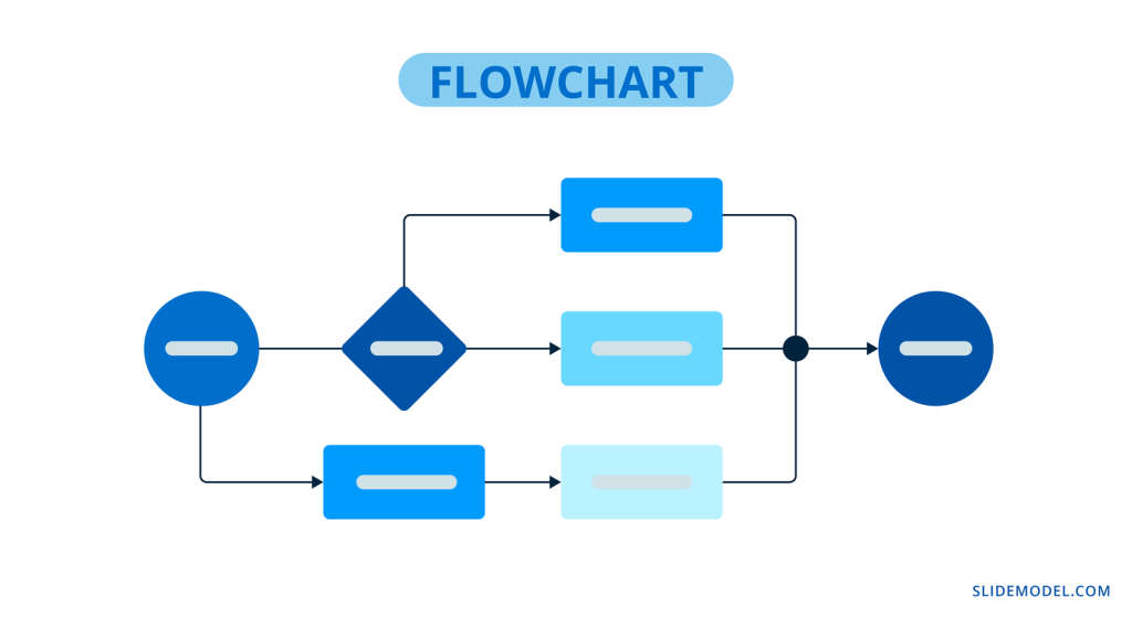
Flowchart Infographic
A flowchart infographic is very versatile in what it does. It allows you to put together a process visually in many different ways. Create decision trees, dichotomous charts, and flowcharts of any type.
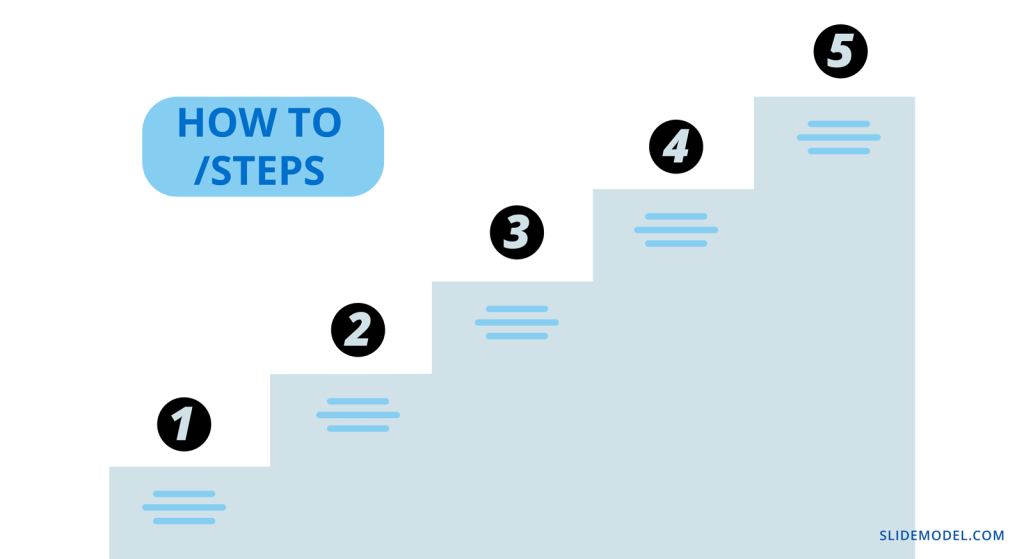
How to / Steps Infographic
One of the most common process infographics is the How-To or Step by Step visualization. There is no limit to how you can create a process infographic like this one. It can be long and vertical or a series of continual slides. These are ideal for training manuals and orientation packets.
Timeline Infographic
A timeline infographic can visualize a series of past events or an expected flow of future events. For example, an About Us slide in a pitch presentation can include a growth timeline.
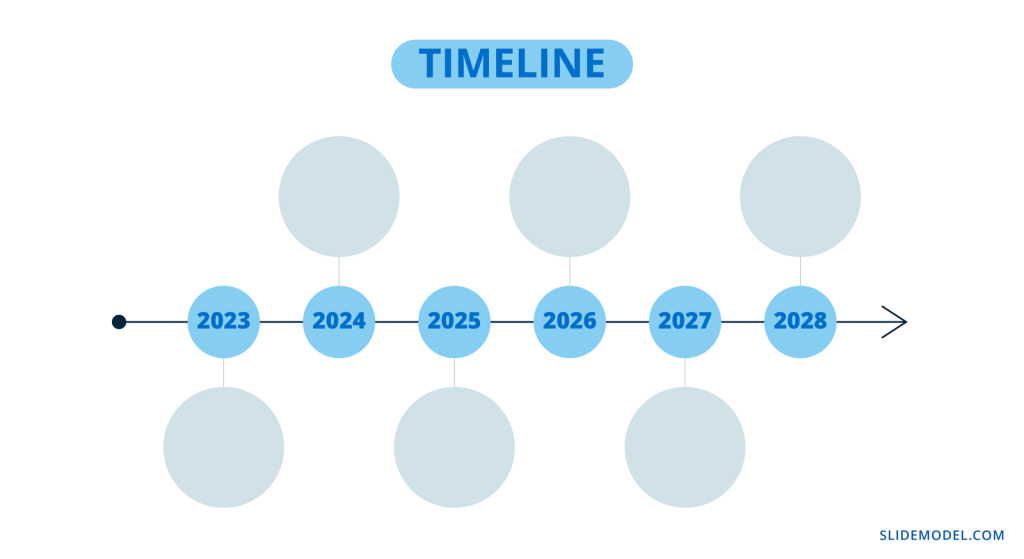
Likewise, in a proposal, you can add a roadmap of goals for the future. Check out our Roadmap templates and Timeline templates for more timeline infographic designs.
What is the purpose of using an infographic slide in a presentation?
Many presentations benefit from one or more infographic slides in the deck. Every business topic has some data or informative aspect that needs analyzing, visualizing, and explaining.
Infographic elements are ideal pieces of the puzzle to tell a story with a presentation. They support the information you’re sharing by making it easier to understand and attractive to look at.
Gone are the days of bullet points and a mishmash of stock photos. Infographic slides are essential when building business decks, they visualize the most important information for your audience.
Visual representation of data engages the viewer’s curiosity and helps with memory and retention.
How To Make An Infographic In PowerPoint
Making an infographic in PowerPoint is easy, especially with SlideModel infographic and diagram templates to help. We’ve put together an actionable step-by-step tutorial for your next infographic.
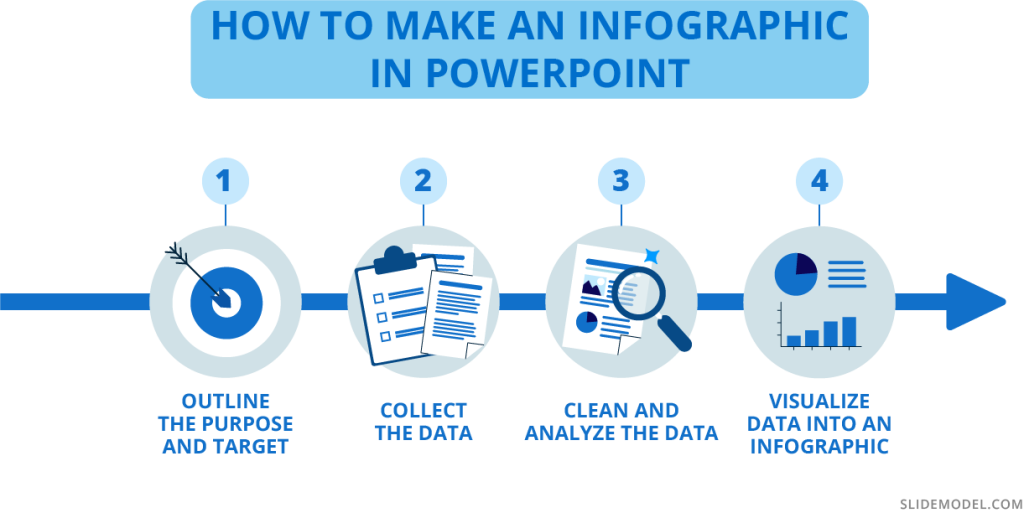
1. Outline the Purpose and Target
Before doing anything, you need to strategize your infographic. What is the purpose behind it? What story do you wish to tell? Are you visualizing survey results, research data, marketing analytics, or something else?
Who is the target? Is it clients, readers, team members, or your teachers? Who are you creating this infographic for? Be sure to know how your target consumes infographics and takes that route; people relate to what they know.
Will you be making a presentation with slides in a portrait format or a vertical infographic? Do you have a lot of numerical data, or is it more informational? Here is a list of infographic options that you can make with PowerPoint and SlideModel:
- One or multiple infographic slides in a complex presentation
- Full Infographic presentation
- Long and vertical infographic
- Square; single or carousel.
Outline these things on a document and have them on hand as you go through the next steps. Take notes as things progress and change. Everything is flexible until you feel that the data story is being told as you envisioned it.
2. Collect the Data
Decide how you will collect the data. Will you conduct research, survey, and round up analytics from data monitoring tools? Will you use existing data from databases like Our World in Data (Population), CDC WONDER database (Health), or other reliable sources?
If you’ll be collecting data via research and surveys, your questions must reflect your purpose and make it relatable to the audience. The wording of the questions needs to be equitable and objective. If sourcing existing data, you’ll need to filter the exact data sets you need and ignore the rest.
Do not manipulate the questions or answer choices to tell the visual story subjectively. Always be objective. If the data reflects something different than you expected, don’t change it to suit your theory.
2. Clean and Analyze the Data
Considering your purpose and target, analyze the data and clean it to fit in your infographic. When choosing what data sets to visualize, manipulate the data objectively so that it’s clear and there are no redundancies. Only use the essential data you need to tell your story.
Separate quantitative and qualitative data into separate sections, as they need to be visualized differently. Quantitative data, i.e., numerical data, can be visualized in charts and graphs, while qualitative data will need percentage gauges and informational visualizations.
Scrape the final data into dimensions like geographic, demographic, cultural, political, and behavioral. This will help you figure out the best way to lay out the data visualizations to tell your story visually and share your findings.
4. Visualize Data Into an Infographic
Now it’s time to visualize the data and turn it into an infographic. When creating an informational infographic, it’s time to write or edit the content to be succinct and short. Do a quick draft of how the information should be laid out. If it’s a step by step or process, it should progress from the top down or from the left to right. Don’t go against natural reading patterns.
Select and take note of the infographic styles you’ll need for your slides or presentation. You’ll likely have to combine different ones to tell your data story completely. For example, a combination of statistical, list, and geography infographic slides is perfect for a visualization of a specific location, and its characteristics.
At this time, you have to consider the visual metaphors that’ll be part of your infographic presentation. How do you come up with the elements for visual metaphors? You can mindmap or brainstorm using keywords and concepts from your data set. For example, imagine your infographic slides about big cities’ wealth gap. You can use visuals or icons representing money, housing styles, and employee satisfaction and mix them up with percentage gauges, large numbers, and subtext. The point is that the visual metaphor creates instant acknowledgment from the viewer.
You’ll need to choose a color palette and font pairing that suits your infographic’s purpose and format. If you already have a branding kit, by all means, use that, otherwise, you can choose your own color palette. Select a font that is easy to read and doesn’t get in the way of the data.
One infographic template slide (it can be any) in different color palettes and font pairings. Four max, in a collage
Start visualizing data sets and place them in order on your canvas or presentation. On a vertical infographic, you’ll need to separate the area into sections that can be followed. Use bits and pieces from several SlideModel templates to create your ideal data composition. Add two or three data sets per slide in a presentation or carousel. Avoid using a single chart per slide; it loses infographic quality and ends up as just a chart.
PRO Tip: Using PowerPoint, you can first create a presentation using 16:9 slides where each slide represents a specific section, and then join all of them together to produce a vertical infographic layout.
Take a look at this infographic dashboard template and get inspired to create compositions like these, where the data sets are grouped per slide. Better yet, if each data group has a specific dimension or category. These can be separated and used as you wish in a vertical infographic.
Tips for preparing data for effective infographics
Here are some essential tips to help you prepare the data for your eye-catching infographics.
Know your data types
You’ll need to know what type of data you’re analyzing before you start visualizing it. All data is categorized into two main types; quantitative and qualitative. In turn, quantitative data can be discreet or continuous, while qualitative data can be nominal or ordinal.
Let’s take a look at what all that means.
- Quantitative data can be measured in numerical values. It answers questions like “how much” and “how many.”
- Discreet: Numerical data in complete integers, no decimals or fractions.
- Continuous: Precise numerical data that can be measured into decimals.
- Qualitative data is called categorical data and isn’t made up of numbers but words, symbols, or pictures.
- Nominal: Variables of data without an intrinsic order.
- Ordinal: Values that can be in order or hierarchical.
Use the data type to inspire the visual metaphors you include in the infographics. These are what help the viewer understand your data story faster.
Use clear data sets or data dimensions
Data dimensions, or data categorization, are essential to data storytelling. If these aren’t clear in the visualization, there’s no backstory or foundation to what is being explained. These are the most common data dimensions you’ll be working with:
- Demographic
- Geographic
- Political
- Behavioral
- Cultural
Many other data dimensions apply to specific topics or industries. For example, in social media marketing, you’ll use metrics such as reach, engagement, views, and followers. But each of these can be subdivided into the basic data dimensions above.
How deep and detailed your data dimensions are, depends on what you want to analyze and share with stakeholders, clients, or team members. The more you understand the dimensions of your topic, the better your infographic will be.
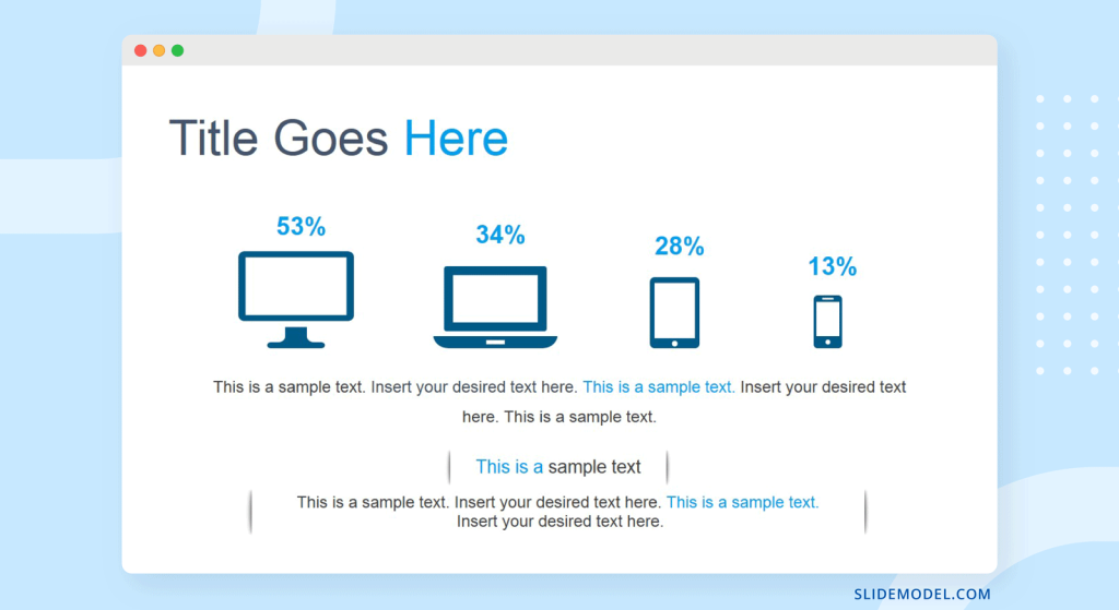
The slide below, for example, shows data dimensions for the different screen types on which people view a digital application.
Choose the right visualization for your data
Finally, knowing what data visualization to pick for your data is essential for a clear flow of information in your infographic. Infographics have a mix of visualizations that work together to tell a story.
Here’s an overview of what visualizations are best for what type of data.
- Quantitative percentages of a whole:
- Pie charts
- Donut charts
- Percentage gauges
- Quantitative Data that spans over time:
- Line graphs
- Bar graphs
- Quantitative and Qualitative Hierarchical data:
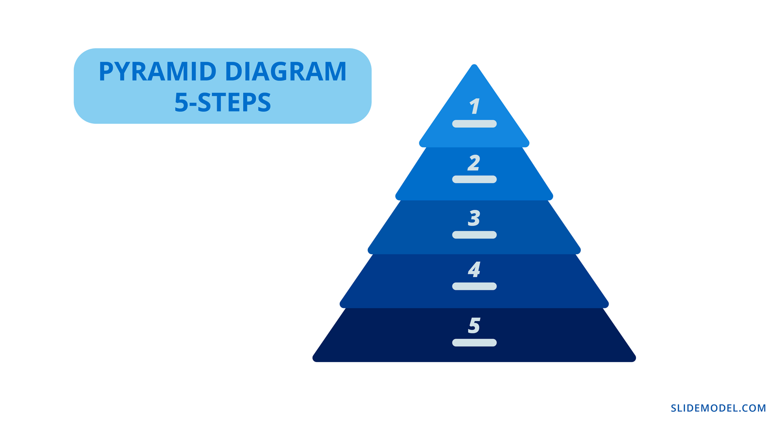
- Pyramid charts
- Funnel charts
- Tree charts
- Quantitative and Qualitative Geographic data:
- Maps
- Color-coded
- Pinned
- Maps
- Quantitative and Qualitative Comparative data
- Tables
- Bubble charts
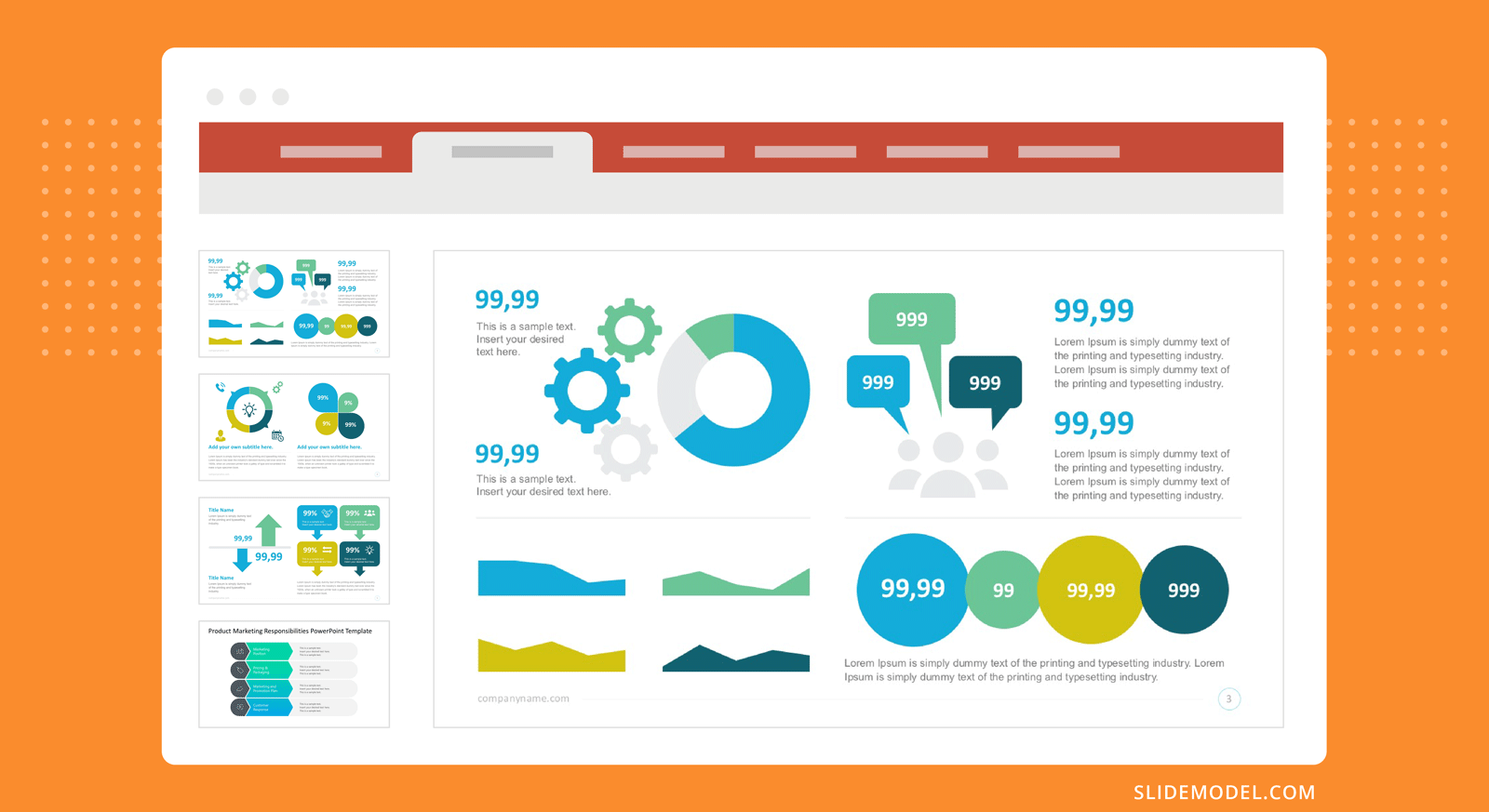
How to use SlideModel’s ready-made infographic templates to make an eye-catching infographic in PowerPoint
Creating an infographic with PowerPoint is much easier when you take advantage of SlideModel templates. We’ve created four infographic case studies to show you the possibilities. Let’s dive in.
Case Study Example 1: Political Analysis Infographic Presentation
A political analyst in Hawaii wants to create an infographic using the results of a recent poll. For this example, we sourced the data from the civilbeat.org website on a poll they conducted about constructing the Thirty Meter Telescope on Mauna Kea.
Let’s look at how this survey can be turned into an infographic presentation. Since there’s a set number of participants and the questions are multiple-choice, the data is numerical (quantitative) and best visualized in percentages. Percentages can be visualized in many ways. Pie charts and donut charts have long been the favorites, but you can try other styles for infographics.
“In the end, when it comes to displaying data — you need to do your best to design a simple story while being accurate.” – Kristi Pelzel,
Slide 1/Slide 2: Title: Will the Thirty Meter Telescope ever be built? Native Hawaiians hope it doesn’t.
Slide 3: 64% support of all voters polled the construction of the Thirty Meter Telescope.
Slide 5: 48% of Native Hawaiians and 53% under 50 don’t support it. (Icons of native Hawaiian and people under 50 and the percentages)
Slide 4: 50% oppose the protests about the TMT while 43% support them (thumbs up and thumbs down visual metaphor)
Slide 5: Mauna Kea already has 13 telescopes. (an outline of Manua Kea and 13 dots along it)
Slide 6: the Hawaii Night Sky Protection Act was initiated on July 1, 2013. (calendar and document visuals)
Slide 7: Mauna Kea is the highest of all the mountain islands and considered sacred by the native Hawaiians.
Slide 8: Construction of the TMT will cost at least, 2400 million USD. (Big number and money icon with the explanation)
Slide 9: Construction of the TMT on Mauna Kea is paused and might be constructed in La Palma, Tenerife. (The two islands and a line to connect them)
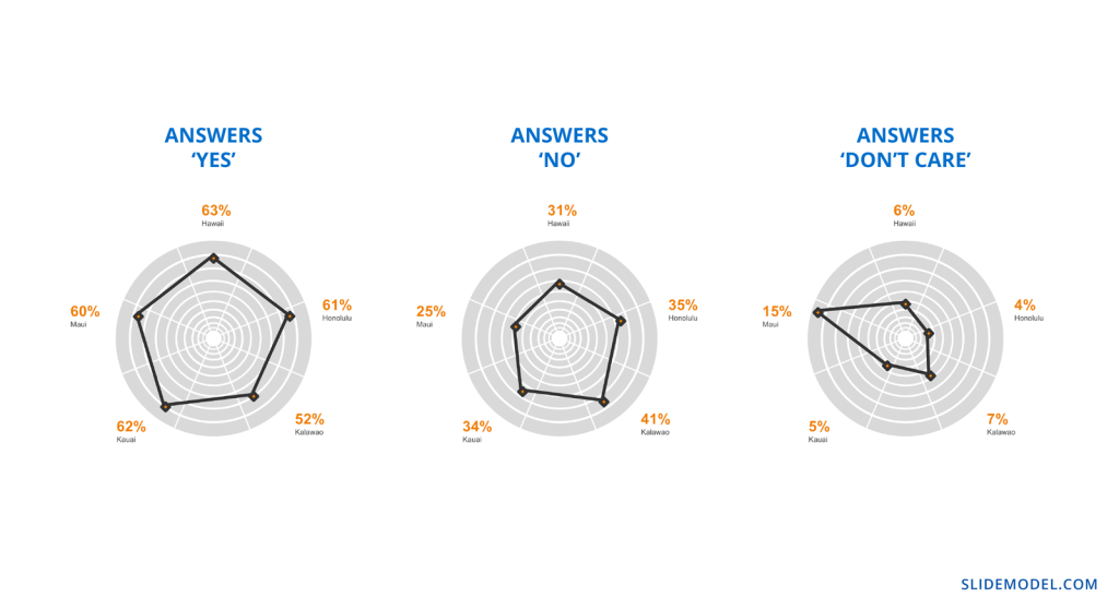
Take a look below at the complete infographic presentation for this case study.
Case Study Example 2: Admission Test Data Results Infographic Presentation
A university in Texas analyzes and visualizes admission test results for SATs taken on students’ graduation year. The purpose is to share the findings with high schools and other universities to help their students perform better on tests.
Each presentation slide is a section of the infographic. Repurpose it to create a 16:9 infographic presentation and a vertical visual infographic to use for other purposes.
We’ve outlined the visualization into sections. Each section is one slide.
Section 1: Texas High School students who SAT tests, perform differently according to ethnicity and economical advantage.
Section 2: The tested topics (Visualization of the topics tested. 1. Math, 2. Critical Reading 3. Writing.)
Section 3: Highest scores: Asians – 1110. Lower scores: Black or African American – 858
A big data set to set the scene, what ethnicity had the highest combined scores. Asian in both years.
Section 4: Economically disadvantaged test takers perform 20% worse than economically advantaged.
Section 5: Between 2007 and 2010 all combined test score results lowered year over year
Case Study Example 3: Marketing and Sales Infographic Presentation
A home security systems company wishes to share its marketing and sales performance in an infographic presentation.
The data is a collection of analytics results from the company’s CRM, customer segmentation and a popup poll on the website sent to repeat customers.
Slide 1: The power of marketing and sales in home security. More people wanted to feel safe at home in 2021
Slide 2: Sales totals per Q1, Q2, Q3, Q4 in dollar amounts. Q1: 780K USD Q2: 910K USD
Q3: 1.2M Q4: 2M
Slide 3: 25% percent of customers were new in 2021, 75% were repeat customers.
Slide 4: 68% of customers live in the east coast of the US. 80% live in cities, 75% in a house
Slide 5: 95% of customers say they’d recommend the product to friends
Case Study Example 4: Social Media Marketing Campaign Performance Infographic Presentation.
A marketing agency has created a social media campaign for a client and wishes to share the results in an infographic.
During and after the campaign, the marketing manager collected all UTM data leading to a dedicates landing page, plus all social media analytics for the posts about the campaign using a special hashtag. Using all this data, they created an infographic presentation to show the client.
Slide 1: Marketing with dedicated hashtags and landing pages have better results for market positioning.
Slide 2: Total followers per Social Channel before and after (social channel icon and arrows going up)
- Instagram – 15K – 17K
- TikTok – 3.5K – 5.2K
- Facebook – 12K – 14K
Slide 3: Churn percentages before and after the campaign
Before: 31% After:25% (exit sign and entry sign)
Slide 4: Percentages of hashtag use. Instagram: 56%, TikTok: 37%, Facebook: 7%
Slide 5: UTM links navigation to landing page, 156K in one month.
Create Engaging Infographic Presentations with SlideModel Templates
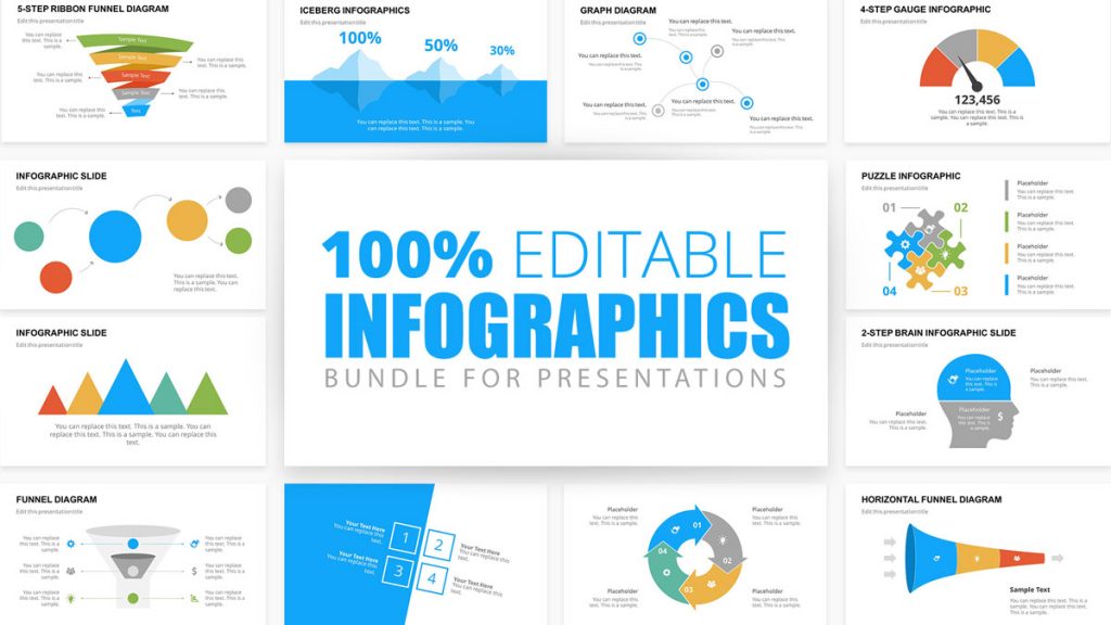
The SlideModel PowerPoint template library is a vast resource for your infographic creation needs. With an unlimited plan, you have access to all presentation templates, with which you‘ll be able to create not just one infographic presentation but as many as you want.
Do you want to create vertical or square infographics on PowerPoint? Download the SlideModel templates you might need and mix and match the elements in your PowerPoint canvas. Your infographic presentations will never be boring again.
1. Infographic PowerPoint
Use This Template

Возвращаю обещанный долг слушателям вебинара, посвящённого образовательной инфографике. Был большой риск, что демонстрация в прямом эфире наглядного примера, как можно создать интерактивную инфографику в PowerPoint, зависнет. Кроме того, в адрес Дидактора также поступали вопросы на заданную тему. Поэтому размещаю ресурс у себя в Дидакторе с подробной инструкцией, как это выполнить для всех читателей.
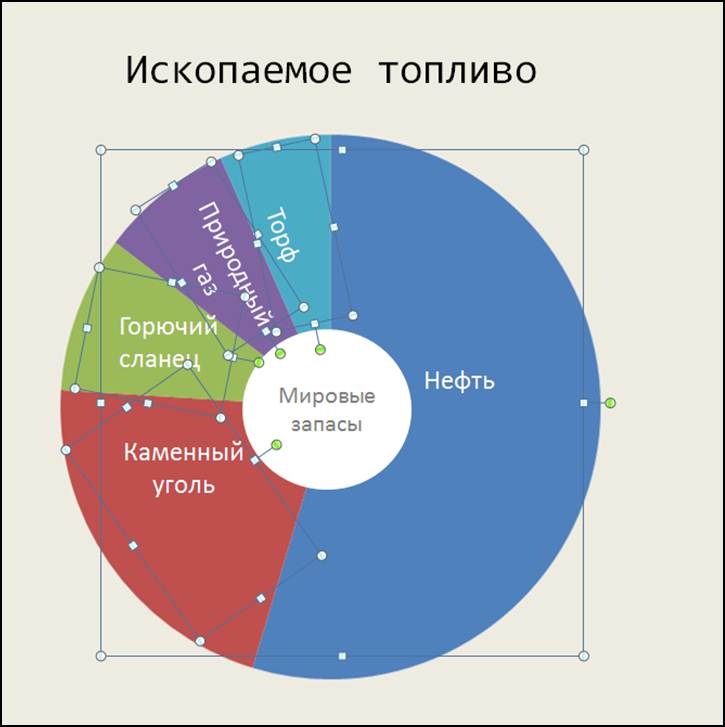
Я уже публиковал интерактивную инфографику Ископаемое топливо со ссылкой на ресурс. Готовясь к вебинару я несколько изменил её. Загрузить разработку вы можете по этой ссылке.
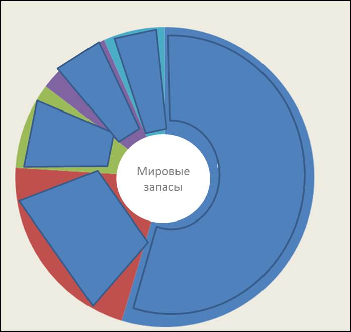
Уже не один раз появлялся от читателей вопрос, КАК её подготовить. В данной статье я публикую подробную инструкцию. Для начала посмотрите интерактивную инфографику Ископаемое топливо. Обратите внимание, что это набросок. Среди данных по странам активны только ссылки по России.
Представляю пошаговую инструкцию.
Шаг 1. Создаём макет интерактивной инфографики
В данном случае это диаграмма.

Кто ещё не вставлял диаграммы в PowerPoint, напоминаю алгоритм: Вставка — Диаграмма — Тип диаграммы.
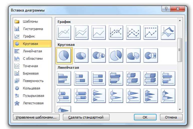
Когда у нас появляется таблица Excel, вставляем свои данные.
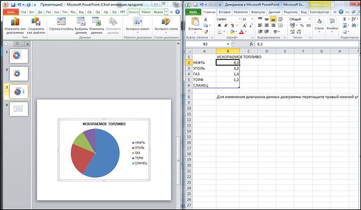
Конечно же, необходимо лучше расставить акценты. Поэтому лучше продублировать данные диаграммы выделенными значениями. Как здесь, например.

Шаг 2. копируем макет и вставляем на все слайды
Определитесь, сколько слайдов будет в вашей разработке с учётом данных по различным категориям.

ВНИМАНИЕ! Когда будете расставлять макет на другие слайды, ни в коем случае не двигайте его. Изначально макет станет в то же место, что и на первом слайде. Если мы не нарушим это условие, мы сможем соблюсти принцип одного экрана, что в данном случае очень важно.
Шаг 3. Наполняем слайды содержанием
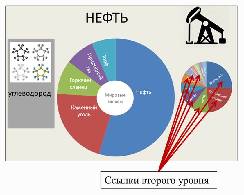
В моей интерактивной инфографике две интерактивных темы. Одна — общие данные по ископаемому топливу. Вторая тема — данные по странам. Поэтому со второго слайда размещаем макет второй темы.

Макет второго уровня указан стрелкой. Макет второго уровня размещается не на всех слайдах, а в зависимости от количества позиций в первом макете. К примеру, в данном случае таких позиций 5. Поэтому макет второго уровня размещается на пяти слайдах: со второго по шестой слайды. Но учтите, при кажущейся одинаковости, диаграммы разные в зависимости от содержания. То есть каждый раз составляем диаграммы на заданные темы. То есть у меня в макете второго уровня 5 разных диаграмм.
Размещаем пиктограммы, ключевые данные. На забывайте требований к инфографике: максимум визуализации, минимум текста.

Шаг 4. Создаём иерархию гиперссылок
В данном случае у нас будут два уровня гиперссылок. Одни направленные на темы.

Ссылки второго уровня направлены на подтемы, а конкретнее на данные по странам.
Итак, цель намечена. Приступаем к созданию невидимых гиперссылок. У нас не будет специальных служебных кнопок, которые будут только отвлекать.
1.Вставляем фигуры на все объекты.

Вставка — Фигуры — Тип фигуры. Подбираем такие фигуры, которые могли бы закрыть максимальное пространство выбранного объекта.
2. Делаем эти фигуры невидимыми.

Передвигаем движок цветности в крайне правое положение, то есть устанавливаем Прозрачность -100%. Цвет линии — нет линий.
Таким образом, мы создали с вами серию невидимых объектов, которые должны стать гиперссылками.
3. Создаём гиперссылки первого уровня.

На первом слайде, где размещён наш макет, создаём гиперссылки на подтемы. Копируем эти невидимые гиперссылки и размещаем их на все остальные слайды нашей разработки.
И здесь также при вставке не делайте «лишних движений». Скопировали и вставили. Гиперссылки займут то же самое место, что и на первом слайде. Теперь мы избавлены от кнопки «возврат домой». Мы сможем передвигаться по нашей интерактивной инфографике как хотим.
4. Создаём гиперссылки второго уровня.

Со второго слайда создаём невидимые гиперссылки второго уровня на слайды с конкретным содержанием. В данном случае это данные по странам по тому или иному ископаемому топливу. Принцип их создания такой же, как и в первом случае.
Всё готово. Напомню, что
Интерактивная инфографика — это способ графического представления информации, позволяющий пользователю взаимодействовать с системой отображения информации и наблюдать ответную реакцию системы.
Поэтому с помощью данного офисного приложения мы своего добились. Кроме этого, мы не загромождаем экран обилием информации, которая также отвлекает внимание учеников.
Безусловно, ваша интерактивная инфографика может выглядеть совершенно иначе, если вы выберете другой макет. Дело в механизме. Надеюсь, я подробно его отразил.
Если вы собираетесь пользоваться интерактивной инфографикой в классе, не забывайте о рекомендациях, как подготовиться к демонстрации вашего учебного ресурса в PowerPoint для работы на интерактивной доске. Если, конечно, она у вас есть.
Если будут ещё вопросы по созданию интерактивной инфографики в PowerPoint, обращайтесь.
Хотя последние несколько лет много говорят о том, что инфографика мертва, это не так. Она жива и здорова, и подтверждение этому ТОП самых популярных статей на Лайкни за прошлый год, где первые два места уверенно занимают инфографики.
Так вот, мало того, что инфографика жива и здорова, она еще и остается важным элементом многих контент-маркетинговых стратегий.
В 2018 году 65% маркетологов в сегменте B2B использовали инфографики, а, по замечанию Джона Медины, эксперта по биологии развития, добавление изображения в текст повышает вероятность того, что материал будет сохранен, на 55%.
Так что если у вас есть штатный дизайнер, самое время поставить ему задачу сделать сногсшибательную инфографику и потом ждать море трафика. Но что делать компаниям, у которых нет компетенций в дизайне или бюджета, чтобы нанять специалиста на аутсорсе?
Например, научиться делать простые инфографики с помощью PowerPoint по инструкции HubSpot, переведенной Лайкни.
1. Как сделать инфографику, наполненную данными
Инфографика и визаулизация данных созданы друг для друга. Так что как только у вас появляются новые данные, которые нужно показать миру, используйте этот формат. Именно для этого предназначен шаблон «Любитель данных».
В конце статьи можно скачать шаблон, который можно наполнить собственными данными. Чтобы изменить данные в диаграммах, кликните правой кнопкой мыши по графику, выберите «Объект» и приступайте к настройке.
Несколько рекомендаций, какой тип диаграммы стоит выбрать в зависимости от ваших целей:
- Гистограмма используется для сравнения категорий или отображения изменений во времени.
- Круговая диаграмма пригодится для сравнения частей целого, лучше всего подходит для работы с небольшими наборами данных.
- График подходит для отображения данных, которые меняются с ходом времени. Идеален для отражения волатильности, трендов, ускорения или замедления процессов.
- Кольцевая диаграмма – стилистический вариант круговой диаграммы, который позволяет разместить в центре число, подпись или какой-то графический элемент.
- Линейчатая диаграмма используется как гистограмма, но горизонтально расположенные столбцы удобнее для отображения длинных названий.
2. Как сделать инфографику-хронику
История отрасли, продукта, бренда или явления могут стать отличным подспорьем для инфографики. И хотя визуализировать процессы, растянутые во времени, можно по-разному, хроника была и остается одним из классических вариантов.
Как сделать хронику в PowerPoint?
1. На панели инструментов выберите SmartArt
Чтобы сделать хронику в PowerPoint на панели инструментов, перейдите в меню «Вставка», выберите SmartArt. Там вы найдете несколько десятков графических элементов, подходящих для вашей задачи.
2. Найдите вариант, который соответствует вашей задумке, в меню «Процесс»
Есть две группы элементов, из которых получаются хроники. Первая – «Процесс». Чтобы облегчить выбор, на скриншоте ниже подсвечены наиболее подходящие варианты.
3. Или выберите «Чередующиеся круги рисунков» в меню «Рисунок»
Еще одна группа элементов, которая может подойти, – «Рисунок». Выберите эту категорию и найдите вариант «Чередующиеся круги рисунков». На скриншоте ниже они подсвечены красным.
4. Добавьте недостающие или удалите лишние временные метки
Для иллюстрации будем использовать вариант «Чередующиеся круги рисунков». Добавьте нужное количество сегментов на слайд в зависимости от количества периодов, которые вы рассматриваете.
5. Отредактируйте текст и изображения
На этом этапе размер графика должен соответствовать объему данных, которые у вас есть. Начинайте заполнять временную шкалу информацией.
6. Отредактируйте текст и изображения графика
Как и с другой графикой, доступной в SmartArt, вы можете редактировать текст и изображения на свое усмотрение. Чтобы добавить изображение, кликните правой кнопкой мыши на значок с пейзажем, выберите рисунок «Из файла» и загрузите изображение с компьютера.
Если свобода творчества для вас не принципиальна, загрузите готовый шаблон, который есть в конце статьи. Он сразу откроется в PowerPoint. Обновите в нем периоды времени и текст и настройте визуальное оформление по своему вкусу. Сделать это можно в разделе «Формат».
Несколько моментов, о которых нужно помнить при создании такой инфографики:
- Исследование. Лучшая инфографика не та, которая красиво нарисована, а та, которая рассказывает историю, основанную на исследованиях. Поэтому прежде чем приступать к созданию хроники, изучите как можно больше информации.
- Узкие рамки. Период в сотню или тысячу лет – это очень интересно, но и на их изучение потребуется немало времени. Чтобы не растекаться мыслью по древу, выбирайте короткие промежутки времени.
- Меньше слов. Инфографика – в первую очередь визуальный формат. Если в какой-то момент вы поймали себя на мысли, что пишете более ста слов для каждого периода, лучше сделайте пост в блог.
3. Как сделать «ультрамодную» инфографику
Безусловно, «модность» инфографики зависит от того, кто ее оценивает. В шаблоне ниже много стрелок и баннеров – красиво это или нет, решать вам. Тем не менее на ней достаточно места для статистики и текста, а в нижней части поместилась гистограмма (вместо которой мог быть любой другой график: достаточно выбрать «Вставка» – «Диаграмма»).
Чтобы убедиться, что итоговый вариант достаточно хорош, обратите внимание на несколько моментов:
- Экспериментируйте с новыми цветовыми палитрами. Найти их можно прямо в Google Картинках по запросу «цветовые палитры». Подходящий вариант вставьте в PowerPoint. Затем в разделе «Формат» – «Границы рисунка» возьмите пипетку, выберите понравившиеся цвета и используйте их для своей инфографики.
- Потратьте время на манипуляции с фигурами. У PowerPoint большая библиотека фигур: рамки, ленты, стрелки и проч. – каждую из которых можно настроить в зависимости от ваших задач и вкуса. Например, концы ленты можно сделать тоньше или короче, а тело стрелки отрегулировать по толщине.
4. Как сделать инфографику в виде блок-схемы
Хотя на первый взгляд такие инфографики кажутся очень простыми, иногда нужно потратить немало времени, чтобы выстроить логические связи между блоками. В примере ниже структура блок-схемы максимально проста: положительные ответы ведут читателя к выводу в левом нижнем угла инфографики, а отрицательные – к результату в правом нижнем углу.
Как убедиться, что ваша блок-схема выстроена логично:
- Нарисуйте схему заранее. Прежде чем нырнуть с головой в PowerPoint, сделайте набросок своей блок-схемы на листе бумаги. Проверьте себя, отвечая на вопросы во всех возможных комбинациях и ища несостыковки. А еще лучше – попросите кого-нибудь постороннего пройти блок-схему.
- Чем меньше область применения, тем проще исполнение. Чем больше вопросов или этапов в схеме, тем сложнее ее реализовать и понять. Поэтому постарайтесь сузить ее насколько возможно.
5. Как сделать инфографику с кучей картинок
Все шаблоны, которые мы разбирали выше, основаны на визуальных элементах, созданных в PowerPoint. Но никто не мешает добавить в инфографику обычные изображения, особенно если это пойдет на пользу делу.
Шаблон ниже отлично подходит для сравнения различных категорий, идей или результатов. И его очень просто сделать: ведь от вас не требуется практически никаких усилий по созданию или настройке фигур.
Несколько советов, как сделать так, чтобы инфографика радовала глаз:
- Используйте качественные изображения. Лучше уменьшить картинку 2000х2000 пикселей, чем 20х20 пикселей. Сжимая из без того небольшие изображения, вы снабжаете инфографику «зернистым принтом».
- Соблюдайте границы. Они сделают изображения частью единого дизайна. В PowerPoint управлять размером, стилем и цветом границ можно во вкладке «Формат».
- Сохраните инфографику в формате PNG. Он хорошо подходит для всех инфографик, но особенно удобен для варианта, содержащего фотографии, так как PNG позволяет сохранить их качество. Как сохранить инфографику в формате PNG: «Файл» – «Сохранить как» – Нужная папка – «Тип файла» – «Рисунок в формате Portable Network Graphics».
Как и обещали – 5 шаблонов инфографик, представленных в статье, от команды HubSpot.
Если у вас есть опыт создания инфографики в PowerPoint, делитесь им в комментариях и присылайте свои примеры шаблонов или готовые графики.
If your infographic presentations aren’t getting noticed as you’d like them to, they’re likely missing something. It’s time to add some visual metaphors and other design techniques to your slides to make your information more visual and engaging.
In this guide, you’ll learn how to make an infographic in PowerPoint and use SlideModel templates to create attractive Infographic slides. With the help of visual metaphors, infographic illustrations and more graphic design elements, you’ll be able to put together infographic presentations like never before.
Table of Contents
- What is an Infographic?
- Which type of infographic should you use?
- Informational Infographic
- List Infographic
- Comparison Infographic
- Anatomical Infographic
- Data Infographics
- Statistical Infographics
- Geographic Infographics
- Process Infographics
- Flowchart
- How to / Steps Infographic
- Timeline Infographic
- Informational Infographic
- What is the purpose of using an infographic slide in a presentation?
- How To Make An Infographic In PowerPoint
- Tips for preparing data for effective infographics
- How to use SlideModel’s ready-made infographic templates to make your infographic in PowerPoint
- Case Study Example 1: Political Analysis Infographic Presentation
- Case Study Example 2: Admission Test Data Results Infographic Presentation
- Case Study Example 3: Marketing and Sales Infographic Presentation
- Case Study Example 4: Social Media Marketing Campaign Performance Infographic Presentation
- Create Engaging Infographic Presentations with SlideModel Templates
What is an Infographic?
An infographic is a visual that tells a story with data and information. Once upon a time, infographics were a design and marketing trend doing the rounds on blogs and social media. They were a welcome and fun take on the boring data we were all bored with. Nowadays, infographics have evolved into being relevant in any type of documentation that tells a data or information story. They’ve stopped being a trend and have justifiably taken a spot in the quintessential content stack for all businesses.
An infographic is a visual that tells a story with data and information.
Frequently, the terms ‘data visualization’ and ‘infographic’ are used interchangeably to describe graphics that visualize information. But there are some differences to take into consideration.
A data visualization is generally a chart or graph that must be read to understand. What differentiates it from an infographic is the way it’s put together. An infographic contextualizes data instead of just visualizing it, it’s a more creative approach that democratizes the way data is understood.
Infographics are sometimes made up of a collection of data visualizations, optimized to be more easily understood and more engaging than just a regular chart.
You can create an infographic however you like, as long as you’re using data visualization techniques and visual metaphors visually tell an informative story. You can even make an infographic with PowerPoint. Even better, use SlideModel templates to help you set it up.
Every infographic tells a story, and stories use visual metaphors to help readers relate to the content. These details convert regular charts into infographics, making them more memorable and engaging.
Visual metaphors are graphic elements that help tell a story in an infographic. For example, imagine a data visualization comparing water usage in cities and villages. In a simple chart without visual metaphors, you must dig deeper into the information to understand what is being analyzed. This only makes sense if the chart is included within a text that gives background and context.
Now, imagine this chart information with visual metaphors like icons of cities and villages and visualizations of drought. When visual metaphors are done well, the viewer can deduce what the infographic is about much faster through an ‘Aha Moment’ of understanding. This leads to the shareability of the infographic and easier communication between the presenter and the audience.
One of the greatest visual metaphors in infographic design is The Iceberg Model. This visual metaphor is of an iceberg sitting part underwater and a small section peeking over the water. The idea is that we see only what’s above water level, while everything else is hidden under the surface.
Which type of infographic should you use?
The type of infographic your team needs depends on if you will share contextual information, numerical data, or a progressive flow. Infographics are grouped into three main content categories; Information, data, and process. Let’s dig deeper.
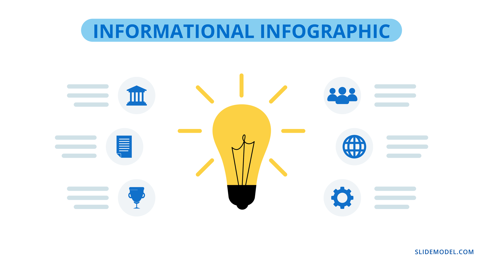
Informational Infographic
The purpose of an informational infographic is to share contextual information with the help of visual storytelling.
This type of infographic doesn’t usually include charts or graphs, it uses elements like icons, illustrations, numbers and shapes alongside short text. Information design projects like editorial and journalistic graphics, wayfaring and museum displays also fit into this category.
List Infographic
Creating a list infographic is easy. Use icons and shapes to create visual sections for each list item. On each slide, include 3 or 4 list items and create a visual continuity between all slides that visualize the list. Alternatively, use a custom size slide in PowerPoint to create a vertical list infographic with a portrait layout. That said, you can use SlideModel templates quite easily on a custom-sized PowerPoint slide or learn how to change the slide size in PowerPoint here.
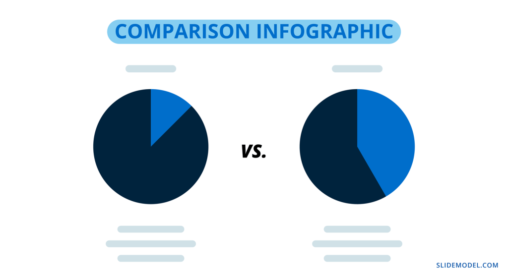
Comparison Infographic
A comparison infographic does what its name states. It compares two or more topics as visually as possible. There are several ways to visualize comparisons from simple to complex; in tables, bubble maps, and side-by-side widgets. Comparison infographic slides are great inside proposals and pitches.
Anatomical Infographic
An anatomical infographic visualizes all the parts and characteristics of a single topic, object, or person. Generally, the central visual topic is a physical object, not a concept. Parts of the main topic are then explained with text and graphics connected with lines. The most common use for anatomical infographics is in education and training.
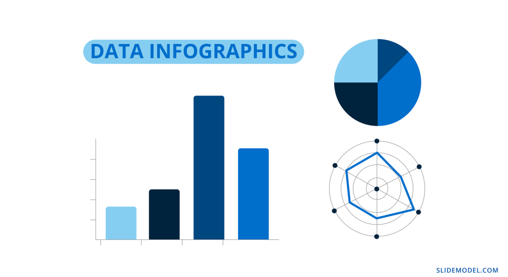
Data Infographics
Data infographics are made up of data visualizations, anywhere from one to multiple visualizations. Often, the question arises if a single chart is also considered an infographic. Technically, yes, but it will depend on its visual quality and the viewer to decide for themselves.
Statistical Infographics
Statistical infographics are the most data-centric of all the examples in this guide. These are the ones full of numbers and charts of all types to visualize information like survey results, research studies, sales and market analyses.
Geographic Infographics
Geographic infographics are made up of location data with maps and legends. They are used to present regional data. Maps can be color-coded to show geographic data from research studies, polls, and census records. Infographic map elements can also be added with location pins.
Process Infographics
Finally, the third type of infographic your business needs to know about is the process infographic. In this case, the idea is to visualize any type of information that follows a process or timeline.
Flowchart
A flowchart infographic is very versatile in what it does. It allows you to put together a process visually in many different ways. Create decision trees, dichotomous charts, and flowcharts of any type.
How to / Steps Infographic
One of the most common process infographics is the How-To or Step by Step visualization. There is no limit to how you can create a process infographic like this one. It can be long and vertical or a series of continual slides. These are ideal for training manuals and orientation packets.
Timeline Infographic
A timeline infographic can visualize a series of past events or an expected flow of future events. For example, an About Us slide in a pitch presentation can include a growth timeline.
Likewise, in a proposal, you can add a roadmap of goals for the future. Check out our Roadmap templates and Timeline templates for more timeline infographic designs.
What is the purpose of using an infographic slide in a presentation?
Many presentations benefit from one or more infographic slides in the deck. Every business topic has some data or informative aspect that needs analyzing, visualizing, and explaining.
Infographic elements are ideal pieces of the puzzle to tell a story with a presentation. They support the information you’re sharing by making it easier to understand and attractive to look at.
Gone are the days of bullet points and a mishmash of stock photos. Infographic slides are essential when building business decks, they visualize the most important information for your audience.
Visual representation of data engages the viewer’s curiosity and helps with memory and retention.
How To Make An Infographic In PowerPoint
Making an infographic in PowerPoint is easy, especially with SlideModel infographic and diagram templates to help. We’ve put together an actionable step-by-step tutorial for your next infographic.
1. Outline the Purpose and Target
Before doing anything, you need to strategize your infographic. What is the purpose behind it? What story do you wish to tell? Are you visualizing survey results, research data, marketing analytics, or something else?
Who is the target? Is it clients, readers, team members, or your teachers? Who are you creating this infographic for? Be sure to know how your target consumes infographics and takes that route; people relate to what they know.
Will you be making a presentation with slides in a portrait format or a vertical infographic? Do you have a lot of numerical data, or is it more informational? Here is a list of infographic options that you can make with PowerPoint and SlideModel:
- One or multiple infographic slides in a complex presentation
- Full Infographic presentation
- Long and vertical infographic
- Square; single or carousel.
Outline these things on a document and have them on hand as you go through the next steps. Take notes as things progress and change. Everything is flexible until you feel that the data story is being told as you envisioned it.
2. Collect the Data
Decide how you will collect the data. Will you conduct research, survey, and round up analytics from data monitoring tools? Will you use existing data from databases like Our World in Data (Population), CDC WONDER database (Health), or other reliable sources?
If you’ll be collecting data via research and surveys, your questions must reflect your purpose and make it relatable to the audience. The wording of the questions needs to be equitable and objective. If sourcing existing data, you’ll need to filter the exact data sets you need and ignore the rest.
Do not manipulate the questions or answer choices to tell the visual story subjectively. Always be objective. If the data reflects something different than you expected, don’t change it to suit your theory.
2. Clean and Analyze the Data
Considering your purpose and target, analyze the data and clean it to fit in your infographic. When choosing what data sets to visualize, manipulate the data objectively so that it’s clear and there are no redundancies. Only use the essential data you need to tell your story.
Separate quantitative and qualitative data into separate sections, as they need to be visualized differently. Quantitative data, i.e., numerical data, can be visualized in charts and graphs, while qualitative data will need percentage gauges and informational visualizations.
Scrape the final data into dimensions like geographic, demographic, cultural, political, and behavioral. This will help you figure out the best way to lay out the data visualizations to tell your story visually and share your findings.
4. Visualize Data Into an Infographic
Now it’s time to visualize the data and turn it into an infographic. When creating an informational infographic, it’s time to write or edit the content to be succinct and short. Do a quick draft of how the information should be laid out. If it’s a step by step or process, it should progress from the top down or from the left to right. Don’t go against natural reading patterns.
Select and take note of the infographic styles you’ll need for your slides or presentation. You’ll likely have to combine different ones to tell your data story completely. For example, a combination of statistical, list, and geography infographic slides is perfect for a visualization of a specific location, and its characteristics.
At this time, you have to consider the visual metaphors that’ll be part of your infographic presentation. How do you come up with the elements for visual metaphors? You can mindmap or brainstorm using keywords and concepts from your data set. For example, imagine your infographic slides about big cities’ wealth gap. You can use visuals or icons representing money, housing styles, and employee satisfaction and mix them up with percentage gauges, large numbers, and subtext. The point is that the visual metaphor creates instant acknowledgment from the viewer.
You’ll need to choose a color palette and font pairing that suits your infographic’s purpose and format. If you already have a branding kit, by all means, use that, otherwise, you can choose your own color palette. Select a font that is easy to read and doesn’t get in the way of the data.
One infographic template slide (it can be any) in different color palettes and font pairings. Four max, in a collage
Start visualizing data sets and place them in order on your canvas or presentation. On a vertical infographic, you’ll need to separate the area into sections that can be followed. Use bits and pieces from several SlideModel templates to create your ideal data composition. Add two or three data sets per slide in a presentation or carousel. Avoid using a single chart per slide; it loses infographic quality and ends up as just a chart.
PRO Tip: Using PowerPoint, you can first create a presentation using 16:9 slides where each slide represents a specific section, and then join all of them together to produce a vertical infographic layout.
Take a look at this infographic dashboard template and get inspired to create compositions like these, where the data sets are grouped per slide. Better yet, if each data group has a specific dimension or category. These can be separated and used as you wish in a vertical infographic.
Tips for preparing data for effective infographics
Here are some essential tips to help you prepare the data for your infographics.
Know your data types
You’ll need to know what type of data you’re analyzing before you start visualizing it. All data is categorized into two main types; quantitative and qualitative. In turn, quantitative data can be discreet or continuous, while qualitative data can be nominal or ordinal.
Let’s take a look at what all that means.
- Quantitative data can be measured in numerical values. It answers questions like “how much” and “how many.”
- Discreet: Numerical data in complete integers, no decimals or fractions.
- Continuous: Precise numerical data that can be measured into decimals.
- Qualitative data is called categorical data and isn’t made up of numbers but words, symbols, or pictures.
- Nominal: Variables of data without an intrinsic order.
- Ordinal: Values that can be in order or hierarchical.
Use the data type to inspire the visual metaphors you include in the infographics. These are what help the viewer understand your data story faster.
Use clear data sets or data dimensions
Data dimensions, or data categorization, are essential to data storytelling. If these aren’t clear in the visualization, there’s no backstory or foundation to what is being explained. These are the most common data dimensions you’ll be working with:
- Demographic
- Geographic
- Political
- Behavioral
- Cultural
Many other data dimensions apply to specific topics or industries. For example, in social media marketing, you’ll use metrics such as reach, engagement, views, and followers. But each of these can be subdivided into the basic data dimensions above.
How deep and detailed your data dimensions are, depends on what you want to analyze and share with stakeholders, clients, or team members. The more you understand the dimensions of your topic, the better your infographic will be.
The slide below, for example, shows data dimensions for the different screen types on which people view a digital application.
Choose the right visualization for your data
Finally, knowing what data visualization to pick for your data is essential for a clear flow of information in your infographic. Infographics have a mix of visualizations that work together to tell a story.
Here’s an overview of what visualizations are best for what type of data.
- Quantitative percentages of a whole:
- Pie charts
- Donut charts
- Percentage gauges
- Quantitative Data that spans over time:
- Line graphs
- Bar graphs
- Quantitative and Qualitative Hierarchical data:
- Pyramid charts
- Funnel charts
- Tree charts
- Quantitative and Qualitative Geographic data:
- Maps
- Color-coded
- Pinned
- Maps
- Quantitative and Qualitative Comparative data
- Tables
- Bubble charts
How to use SlideModel’s ready-made infographic templates to make your infographic in PowerPoint
Creating an infographic with PowerPoint is much easier when you take advantage of SlideModel templates. We’ve created four infographic case studies to show you the possibilities. Let’s dive in.
Case Study Example 1: Political Analysis Infographic Presentation
A political analyst in Hawaii wants to create an infographic using the results of a recent poll. For this example, we sourced the data from the civilbeat.org website on a poll they conducted about constructing the Thirty Meter Telescope on Mauna Kea.
Let’s look at how this survey can be turned into an infographic presentation. Since there’s a set number of participants and the questions are multiple-choice, the data is numerical (quantitative) and best visualized in percentages. Percentages can be visualized in many ways. Pie charts and donut charts have long been the favorites, but you can try other styles for infographics.
“In the end, when it comes to displaying data — you need to do your best to design a simple story while being accurate.” – Kristi Pelzel,
Slide 1/Slide 2: Title: Will the Thirty Meter Telescope ever be built? Native Hawaiians hope it doesn’t.
Slide 3: 64% support of all voters polled the construction of the Thirty Meter Telescope.
Slide 5: 48% of Native Hawaiians and 53% under 50 don’t support it. (Icons of native Hawaiian and people under 50 and the percentages)
Slide 4: 50% oppose the protests about the TMT while 43% support them (thumbs up and thumbs down visual metaphor)
Slide 5: Mauna Kea already has 13 telescopes. (an outline of Manua Kea and 13 dots along it)
Slide 6: the Hawaii Night Sky Protection Act was initiated on July 1, 2013. (calendar and document visuals)
Slide 7: Mauna Kea is the highest of all the mountain islands and considered sacred by the native Hawaiians.
Slide 8: Construction of the TMT will cost at least, 2400 million USD. (Big number and money icon with the explanation)
Slide 9: Construction of the TMT on Mauna Kea is paused and might be constructed in La Palma, Tenerife. (The two islands and a line to connect them)
Take a look below at the complete infographic presentation for this case study.
Case Study Example 2: Admission Test Data Results Infographic Presentation
A university in Texas analyzes and visualizes admission test results for SATs taken on students’ graduation year. The purpose is to share the findings with high schools and other universities to help their students perform better on tests.
Each presentation slide is a section of the infographic. Repurpose it to create a 16:9 infographic presentation and a vertical visual infographic to use for other purposes.
We’ve outlined the visualization into sections. Each section is one slide.
Section 1: Texas High School students who SAT tests, perform differently according to ethnicity and economical advantage.
Section 2: The tested topics (Visualization of the topics tested. 1. Math, 2. Critical Reading 3. Writing.)
Section 3: Highest scores: Asians – 1110. Lower scores: Black or African American – 858
A big data set to set the scene, what ethnicity had the highest combined scores. Asian in both years.
Section 4: Economically disadvantaged test takers perform 20% worse than economically advantaged.
Section 5: Between 2007 and 2010 all combined test score results lowered year over year
Case Study Example 3: Marketing and Sales Infographic Presentation
A home security systems company wishes to share its marketing and sales performance in an infographic presentation.
The data is a collection of analytics results from the company’s CRM, customer segmentation and a popup poll on the website sent to repeat customers.
Slide 1: The power of marketing and sales in home security. More people wanted to feel safe at home in 2021
Slide 2: Sales totals per Q1, Q2, Q3, Q4 in dollar amounts. Q1: 780K USD Q2: 910K USD
Q3: 1.2M Q4: 2M
Slide 3: 25% percent of customers were new in 2021, 75% were repeat customers.
Slide 4: 68% of customers live in the east coast of the US. 80% live in cities, 75% in a house
Slide 5: 95% of customers say they’d recommend the product to friends
Case Study Example 4: Social Media Marketing Campaign Performance Infographic Presentation.
A marketing agency has created a social media campaign for a client and wishes to share the results in an infographic.
During and after the campaign, the marketing manager collected all UTM data leading to a dedicates landing page, plus all social media analytics for the posts about the campaign using a special hashtag. Using all this data, they created an infographic presentation to show the client.
Slide 1: Marketing with dedicated hashtags and landing pages have better results for market positioning.
Slide 2: Total followers per Social Channel before and after (social channel icon and arrows going up)
- Instagram – 15K – 17K
- TikTok – 3.5K – 5.2K
- Facebook – 12K – 14K
Slide 3: Churn percentages before and after the campaign
Before: 31% After:25% (exit sign and entry sign)
Slide 4: Percentages of hashtag use. Instagram: 56%, TikTok: 37%, Facebook: 7%
Slide 5: UTM links navigation to landing page, 156K in one month.
Create Engaging Infographic Presentations with SlideModel Templates
The SlideModel PowerPoint template library is a vast resource for your infographic creation needs. With an unlimited plan, you have access to all presentation templates, with which you‘ll be able to create not just one infographic presentation but as many as you want.
Do you want to create vertical or square infographics on PowerPoint? Download the SlideModel templates you might need and mix and match the elements in your PowerPoint canvas. Your infographic presentations will never be boring again.
1. Infographic PowerPoint
Use This Template
Возвращаю обещанный долг слушателям вебинара, посвящённого образовательной инфографике. Был большой риск, что демонстрация в прямом эфире наглядного примера, как можно создать интерактивную инфографику в PowerPoint, зависнет. Кроме того, в адрес Дидактора также поступали вопросы на заданную тему. Поэтому размещаю ресурс у себя в Дидакторе с подробной инструкцией, как это выполнить для всех читателей.
Я уже публиковал интерактивную инфографику Ископаемое топливо со ссылкой на ресурс. Готовясь к вебинару я несколько изменил её. Загрузить разработку вы можете по этой ссылке.
Уже не один раз появлялся от читателей вопрос, КАК её подготовить. В данной статье я публикую подробную инструкцию. Для начала посмотрите интерактивную инфографику Ископаемое топливо. Обратите внимание, что это набросок. Среди данных по странам активны только ссылки по России.
Представляю пошаговую инструкцию.
Шаг 1. Создаём макет интерактивной инфографики
В данном случае это диаграмма.
Кто ещё не вставлял диаграммы в PowerPoint, напоминаю алгоритм: Вставка — Диаграмма — Тип диаграммы.
Когда у нас появляется таблица Excel, вставляем свои данные.
Конечно же, необходимо лучше расставить акценты. Поэтому лучше продублировать данные диаграммы выделенными значениями. Как здесь, например.
Шаг 2. копируем макет и вставляем на все слайды
Определитесь, сколько слайдов будет в вашей разработке с учётом данных по различным категориям.
ВНИМАНИЕ! Когда будете расставлять макет на другие слайды, ни в коем случае не двигайте его. Изначально макет станет в то же место, что и на первом слайде. Если мы не нарушим это условие, мы сможем соблюсти принцип одного экрана, что в данном случае очень важно.
Шаг 3. Наполняем слайды содержанием
В моей интерактивной инфографике две интерактивных темы. Одна — общие данные по ископаемому топливу. Вторая тема — данные по странам. Поэтому со второго слайда размещаем макет второй темы.
Макет второго уровня указан стрелкой. Макет второго уровня размещается не на всех слайдах, а в зависимости от количества позиций в первом макете. К примеру, в данном случае таких позиций 5. Поэтому макет второго уровня размещается на пяти слайдах: со второго по шестой слайды. Но учтите, при кажущейся одинаковости, диаграммы разные в зависимости от содержания. То есть каждый раз составляем диаграммы на заданные темы. То есть у меня в макете второго уровня 5 разных диаграмм.
Размещаем пиктограммы, ключевые данные. На забывайте требований к инфографике: максимум визуализации, минимум текста.
Шаг 4. Создаём иерархию гиперссылок
В данном случае у нас будут два уровня гиперссылок. Одни направленные на темы.
Ссылки второго уровня направлены на подтемы, а конкретнее на данные по странам.
Итак, цель намечена. Приступаем к созданию невидимых гиперссылок. У нас не будет специальных служебных кнопок, которые будут только отвлекать.
1.Вставляем фигуры на все объекты.
Вставка — Фигуры — Тип фигуры. Подбираем такие фигуры, которые могли бы закрыть максимальное пространство выбранного объекта.
2. Делаем эти фигуры невидимыми.
Передвигаем движок цветности в крайне правое положение, то есть устанавливаем Прозрачность -100%. Цвет линии — нет линий.
Таким образом, мы создали с вами серию невидимых объектов, которые должны стать гиперссылками.
3. Создаём гиперссылки первого уровня.
На первом слайде, где размещён наш макет, создаём гиперссылки на подтемы. Копируем эти невидимые гиперссылки и размещаем их на все остальные слайды нашей разработки.
И здесь также при вставке не делайте «лишних движений». Скопировали и вставили. Гиперссылки займут то же самое место, что и на первом слайде. Теперь мы избавлены от кнопки «возврат домой». Мы сможем передвигаться по нашей интерактивной инфографике как хотим.
4. Создаём гиперссылки второго уровня.
Со второго слайда создаём невидимые гиперссылки второго уровня на слайды с конкретным содержанием. В данном случае это данные по странам по тому или иному ископаемому топливу. Принцип их создания такой же, как и в первом случае.
Всё готово. Напомню, что
Интерактивная инфографика — это способ графического представления информации, позволяющий пользователю взаимодействовать с системой отображения информации и наблюдать ответную реакцию системы.
Поэтому с помощью данного офисного приложения мы своего добились. Кроме этого, мы не загромождаем экран обилием информации, которая также отвлекает внимание учеников.
Безусловно, ваша интерактивная инфографика может выглядеть совершенно иначе, если вы выберете другой макет. Дело в механизме. Надеюсь, я подробно его отразил.
Если вы собираетесь пользоваться интерактивной инфографикой в классе, не забывайте о рекомендациях, как подготовиться к демонстрации вашего учебного ресурса в PowerPoint для работы на интерактивной доске. Если, конечно, она у вас есть.
Если будут ещё вопросы по созданию интерактивной инфографики в PowerPoint, обращайтесь.
Инфографика получила широкое распространение как средство распространения информации в социальных сетях, в образовании и как часть маркетинговых стратегий. Существует множество методов, которые можно использовать для создания инфографики, при этом инструмент слайд-шоу PowerPoint является легкодоступным вариантом. Понимание того, как создавать инфографику с помощью Microsoft PowerPoint, поможет сделать ваши презентации и информационные материалы более увлекательными. В этой статье мы обсудим, что такое инфографика и когда профессионалы могут ее использовать, перечислим шаги по созданию собственной инфографики в PowerPoint и дадим несколько советов по созданию лучшей инфографики из возможных.
Что такое инфографика?
Инфографика — это наглядное изображение, обычно состоящее из графиков, изображений и текста с целью распространения информации. Инфографика является важным маркетинговым инструментом, который может донести информацию до общественности как эффективным, так и эстетически привлекательным способом. Инфографики используют профессионалы из разных отраслей, но все они направлены на информирование. Главная сила инфографики заключается в ее способности удерживать внимание аудитории.
Инфографика часто использует визуальные инструменты, такие как временные шкалы и графики, чтобы привлечь внимание потребителя. Хотя в интернете есть множество программ для создания инфографики, вы можете использовать презентационный инструмент PowerPoint для создания информативной, визуально удовлетворительной инфографики.
Когда профессионалы могут использовать инфографику в PowerPoint?
Существует множество случаев, когда профессионалы могут использовать PowerPoint для создания инфографики, в том числе:
-
Деловые презентации: При проведении деловой презентации важно заинтересовать аудиторию. Использование инфографики поможет вам представить необходимую информацию в увлекательной форме.
-
Совещания: На собраниях часто представляется большое количество информации, которую сотрудникам важно сохранить и понять. Вы можете использовать инфографику, чтобы сжать информацию и сосредоточиться на самых важных компонентах вашей презентации.
-
Маркетинг: Инфографика — распространенный инструмент в маркетинговой индустрии. Компании могут использовать инфографику как часть своих маркетинговых кампаний, делясь ею в социальных сетях, рассылая ее по электронной почте или используя в качестве рекламы на публике.
-
Общественные объявления: Правительственные организации также могут использовать инфографику в качестве метода донесения информации до общественности. Объявления и предупреждения о безопасности часто появляются визуально в виде инфографики, чтобы информировать людей о различных ситуациях.
Как создавать инфографику в PowerPoint
Вот пошаговое руководство по созданию инфографики в PowerPoint:
1. Начните новую презентацию
Первый шаг к созданию инфографики в PowerPoint — создать пустой слайд в рамках новой презентации. Это можно сделать, открыв программу и нажав кнопку Новый на левой боковой панели, а затем выбрав пункт Пустая презентация формат. Нажмите Создайте в правой нижней части экрана, и на экране появится новая презентация и слайд.
2. Переключите слайд в портретный режим
По умолчанию в PowerPoint презентации создаются в альбомном виде, но инфографика, как правило, имеет портретный стиль. Чтобы изменить это, нажмите кнопку Дизайн вкладка в верхней части экрана. Затем нажмите Размер слайда и перейдите на страницу Ориентация раздел. Измените ориентацию слайдов с альбомной на книжную. У вас также есть возможность настроить размер инфографики, причем 6 дюймов в ширину на 14 дюймов в высоту являются хорошей отправной точкой.
3. Выберите фон
Хотя вы можете выбрать стандартный белый фон, вы также можете изменить его в соответствии с эстетикой, которую вы хотите передать в своей инфографике. Чтобы изменить фон, щелкните правой кнопкой мыши на слайде и перейдите к пункту Форматировать фон. Откроется окно выбора, в котором можно выбрать градиент, узор, текстуру, прозрачность и цвет фона.
4. Добавьте текст заголовка и подзаголовка
Заголовок является одной из центральных точек вашей инфографики, поэтому подумайте о привлекательном заголовке и подзаголовке, которые привлекут внимание вашей аудитории. Настройки слайдов по умолчанию включают текстовое поле для заголовка и подзаголовка. Щелкните эти текстовые поля, чтобы вставить нужные заголовки и подзаголовки.
5. Открыть SmartArt и выбирайте визуальные элементы
SmartArt — это приложение в PowerPoint, которое дает пользователям возможность вставлять различные визуальные элементы, включая графики, диаграммы и фигуры. Чтобы открыть SmartArt, нажмите Вставить на верхней панели и перейдите к пункту SmartArt значок. После открытия у вас будет выбор из нескольких типов графиков. Блок-схемы, пирамиды, циклы и диаграммы — вот несколько вариантов, доступных пользователям. Когда вы определитесь с графическим стилем, нажмите на его значок, а затем на кнопку OK кнопка. Вы также можете изменить цвета вашей графики, щелкнув ее и выбрав следующие цвета Изменить цвет опция.
6. Добавить информативный текст
Цель всех инфографик — информировать, поэтому включение качественного текста является важной частью создания эффективной инфографики. Чтобы добавить текст в графику SmartArt, щелкните на графике и введите текст в соответствующее поле. Чтобы добавить текст на фон инфографики, нажмите кнопку Вставка и перейдите к пункту Текстовый блок значок и выберите область, в которой должен появиться текст. У вас также есть возможность создавать пользовательские текстовые поля и графику с помощью функции Формы инструмент под Вставить.
7. Добавить изображения
Инфографика эффективна в основном благодаря обширным визуальным элементам. Хотя важно включить информативный текст и графику, вы также можете добавить в инфографику соответствующие изображения. Чтобы включить загруженное изображение, нажмите Вставить и перейдите к Изображение. Вам будет предложено выбрать изображение с вашего компьютера для загрузки. PowerPoint также предоставляет пользователям возможность поиска картинок в Интернете во время работы с приложением.
8. Сохраните инфографику
После того как вы просмотрели свою инфографику на предмет точности, пришло время сохранить ее. Нажмите Файл в верхней части экрана и перейдите к пункту Сохранить как. В результате вам будет предложено ввести название проекта и тип файла. Для обмена инфографикой чаще всего используются файлы PDF, JPG и PNG. После того, как вы нажмете Сохранить, у вас есть возможность сохранить отдельный слайд инфографики, а не всю презентацию. Это позволит удалить все пустые слайды, которые предварительно загружены в PowerPoint при начале нового проекта.
Советы по созданию инфографики
Вот несколько советов, которые помогут вам создать следующую инфографику с помощью PowerPoint:
-
Старайтесь, чтобы ваша графика была простой и понятной, чтобы помочь вашей аудитории сосредоточиться и усвоить информацию.
-
Включите такие элементы дизайна, как значки, границы и шрифты, чтобы ваша инфографика выделялась на фоне других.
-
Определите цветовую схему, которой должны соответствовать все ваши визуальные компоненты, выделив одним цветом наиболее важную информацию.
-
Изучите существующие инфографики в Интернете для получения рекомендаций и вдохновения.
Обратите внимание, что ни одна из компаний, упомянутых в этой статье, не связана с Indeed.
Создание презентации в программе PowerPoint может принести огромную пользу для вашей карьеры или проекта. Однако, визуальный аспект является одним из ключевых факторов, который делает вашу презентацию привлекательной и запоминающейся для аудитории. В этой статье мы рассмотрим, как быстро и легко добавить инфографику к вашей презентации.
Инфографика – это графическое представление информации, которое помогает улучшить визуальную эффективность вашей презентации. В ней можно использовать диаграммы, таблицы, графики, схемы и другие варианты визуализации данных.
Сегодня инфографика является неотъемлемой частью любой презентации. Она помогает улучшить коммуникацию с аудиторией и лучше донести ваши мысли и идеи. Также она может помочь вам сделать презентацию более визуально привлекательной и запоминающейся. Эта статья дает пошаговую инструкцию по добавлению инфографики в ваш PowerPoint презентацию.
Содержание
- Простой способ добавить инфографику в PowerPoint
- Шаг 1: Подготовка PowerPoint к созданию инфографики
- 1.1. Установка правильных размеров и ориентации слайда
- 1.2. Выбор темы и шаблона
- 1.3. Настройка цветовой гаммы и шрифтов
- Шаг 2: Поиск готовых инфографик
- Шаг 3: Скачивание и импорт инфографики в PowerPoint
- Шаг 4: Редактирование и оформление инфографики
- Шаг 5: Сохранение и экспорт презентации
- Вопрос-ответ
- Что такое инфографика и зачем ее добавлять в PowerPoint презентацию?
- Каким образом можно добавить инфографику в PowerPoint?
- Какие графические элементы можно использовать при создании инфографик?
- Существуют ли готовые шаблоны инфографики для PowerPoint?
- Можно ли создать инфографику для PowerPoint в специализированном графическом редакторе?
Простой способ добавить инфографику в PowerPoint
Создание наглядных и красивых презентаций в PowerPoint становится еще более удобным, когда вы добавляете в них инфографику. Инфографика может сделать презентацию более понятной и меморабельной, а также помочь вам представить данные в удобном формате.
Добавление инфографики в PowerPoint очень просто. Сначала вы должны подобрать подходящую графическую иконку, диаграмму, график или любой другой наглядный элемент. Вы можете создать их самостоятельно или воспользоваться уже готовыми шаблонами PowerPoint.
Вставка инфографики в слайд происходит с помощью команды «Вставка» на главной панели инструментов PowerPoint. После этого выберите нужный элемент и нажмите на кнопку «Вставить». Как только элемент будет добавлен, вы можете изменить его размер, цвет или любые другие параметры для достижения желаемого эффекта.
Теперь вы можете добавить текстовые комментарии к вашей инфографике, чтобы подчеркнуть ключевые моменты или обеспечить большее понимание данных. Вы также можете использовать анимацию и переходы, чтобы сделать свою презентацию более динамичной и интересной для зрителей.
Как видите, добавление инфографики в PowerPoint — это очень просто. Сделайте свою презентацию еще более наглядной и интересной, добавляя в нее цветные и яркие изображения, диаграммы и графики. Ваша аудитория оценит вашу работу и запомнит ее легче благодаря использованию инфографики.
Шаг 1: Подготовка PowerPoint к созданию инфографики
Перед началом создания инфографики на PowerPoint необходимо убедиться, что все настройки окна программы настроены верно. Это поможет избежать множества проблем и ошибок при создании дизайна.
1.1. Установка правильных размеров и ориентации слайда
Перед созданием инфографики, важно убедиться, что размеры слайда установлены правильно. Это может быть как стандартный размер, так и настроенный индивидуально. Кроме того, нужно убедиться, что ориентация слайда соответствует заданной ориентации дизайна.
1.2. Выбор темы и шаблона
Выбор темы и шаблона является важным этапом при создании инфографики на PowerPoint. Лучше использовать шаблоны с фоновыми изображениями и элементами дизайна, чтобы сделать презентацию более заметной и привлекательной для зрителей. Некоторые шаблоны содержат готовые элементы для создания диаграмм и графиков, что может ускорить процесс создания.
1.3. Настройка цветовой гаммы и шрифтов
Цветовая гамма и шрифты являются важными элементами в создании инфографики. Следует выбрать цветовую гамму, которая подходит к выбранной теме и может усилить эффекта дизайна. Также необходимо убедиться, что выбранный шрифт хорошо читаем и подходит к стилю и теме.
Шаг 2: Поиск готовых инфографик
Если вы не хотите тратить время на создание инфографики с нуля, то можно воспользоваться готовыми шаблонами и изображениями.
Для поиска готовых инфографик можно использовать специализированные сайты и сервисы. Например, такие как Canva, Infogram, Piktochart, Freepik. Также можно найти множество бесплатных шаблонов на сайтах с векторной графикой, таких как Shutterstock, Vecteezy, Flaticon.
Выбирая готовую инфографику, обращайте внимание на ее качество и соответствие теме вашей презентации. Также не забывайте уточнять условия использования изображений и шаблонов с авторским правом.
- Оценивайте качество и эстетику графиков и диаграмм
- Предпочтительнее использовать шаблоны в соответствии с вашей темой
- При использовании готовых изображений проверьте, что автор не требует дополнительного разрешения на их использование
Шаг 3: Скачивание и импорт инфографики в PowerPoint
Как только вы нашли подходящую инфографику, нужно ее скачать на свой компьютер. Обычно в поисковике можно найти множество источников, где представлены готовые инфографики, как бесплатные, так и платные.
После того как вы скачали инфографику, нужно импортировать ее в PowerPoint. Для этого вставляем ее как обычный рисунок, используя соответствующую функцию программы. Открываете вкладку «Вставка» и выбираем «Изображение». В появившемся окне выбираем нужный файл и нажимаем кнопку «Вставить».
После того как инфографика была добавлена в PowerPoint, можно начинать ее редактировать. Важно помнить, что можно изменять цвета, размеры и дополнительно добавлять текст, чтобы усилить воздействие на зрителя. Редактирование инфографики происходит в разделе «Рисунок», на которого нужно кликнуть дважды для получения доступа к настройкам редактирования.
Все инфографики разные по сложности и стилю, поэтому вам может понадобиться экспериментировать с настройками подгонки и масштабирования. Пробуйте добавлять дополнительные элементы, перетаскивать их с одного места на другое и, в результате, создавать свои уникальные инфографики для презентации.
Шаг 4: Редактирование и оформление инфографики
Когда инфографика добавлена на слайд, можно приступать к ее редактированию и оформлению. Перед началом работы следует определить, какую информацию необходимо выделить и каким образом это будет сделано.
Одним из способов визуализации данных является использование цветов. Однако, следует помнить, что некоторые цвета могут вызывать разные эмоции. Например, красный цвет может ассоциироваться с опасностью или признаком запрета, а зеленый – с цветом надежды и успеха.
Кроме того, при оформлении инфографики можно использовать различные элементы графического дизайна, такие как графики, иконки и шрифты. Важно не перегружать слайд множеством элементов и сохранять простоту, чтобы донести информацию до аудитории наиболее понятным и доступным образом.
- Изменение цветовой гаммы инфографики
- Добавление элементов графического дизайна
- Установка правильного соотношения между визуальными компонентами
По завершению работы над инфографикой следует проверить ее на читабельность и соответствие тематике презентации. Не забывайте, что инфографика должна дополнять вашу речь и помогать убедительно и наглядно преподнести информацию аудитории.
Шаг 5: Сохранение и экспорт презентации
После того, как вы добавили инфографику в свою презентацию, следует сохранить ее. Для этого необходимо выбрать вкладку «Файл» и выбрать опцию «Сохранить как».
В открывшемся окне выберите место сохранения и введите название презентации. Нажмите кнопку «Сохранить».
Если же вам необходимо экспортировать презентацию, чтобы отправить ее на почту или загрузить на сайт, выберите вкладку «Файл» и выберите нужный формат экспорта. Например, вы можете выбрать формат PDF, чтобы презентацию можно было просмотреть без PowerPoint.
Выберите место сохранения и нажмите кнопку «Сохранить». Экспортированная презентация готова к использованию вне PowerPoint.
Вопрос-ответ
Что такое инфографика и зачем ее добавлять в PowerPoint презентацию?
Инфографика — это визуальный способ представления информации в виде графиков, диаграмм, таблиц и иллюстраций. Добавление инфографики в презентацию помогает улучшить ее визуальное впечатление, сделать презентацию более понятной и запоминающейся, а также облегчить восприятие сложной информации.
Каким образом можно добавить инфографику в PowerPoint?
Чтобы добавить инфографику в PowerPoint, необходимо открыть презентацию, выбрать слайд, на котором хотите разместить инфографику, и вставить нужный элемент инфографики, используя соответствующую функцию PowerPoint. Для этого можно выбрать готовый шаблон инфографики или создать свой собственный элемент инфографики.
Какие графические элементы можно использовать при создании инфографик?
При создании инфографики для PowerPoint презентации можно использовать множество графических элементов: диаграммы, графики, круговые и столбцовые диаграммы, инфографики-стрелки, схемы, зоны роста, линейки и т.д.
Существуют ли готовые шаблоны инфографики для PowerPoint?
Да, существуют готовые шаблоны инфографики для PowerPoint, которые можно найти в интернете, скачать и использовать в своих презентациях. Однако, не рекомендуется использовать такие шаблоны буквально, лучше адаптировать под свои нужды, изменить цвета, добавить свои данные и т.д.
Можно ли создать инфографику для PowerPoint в специализированном графическом редакторе?
Да, можно создать инфографику для PowerPoint в специализированном графическом редакторе, таком как Adobe Illustrator или CorelDRAW. Однако, для этого требуется навыки работы с такими редакторами, а также конвертация графического файла в формат, который можно вставить в PowerPoint презентацию.